Identity, websites and decks for the ecosystem
A product that doesn’t exist yet has to look like it already works
An ecosystem that didn’t exist yet. Identity, websites, two apps and decks for two very different audiences. The job was to sell the idea, because there was no interface to show.
- Visual identity
- Web and mobile
- Decks
What I did
I owned the visual side of the whole ecosystem: the identity, the websites for each direction, the look of two apps, the 3D objects and the decks.
There were two decks. One for investors, one for the affiliate network. Different conversations, so a different order of spreads and a different emphasis.
The hard part was never the layout. There was no product yet and nothing to show, and people were making decisions off these slides.

CIX
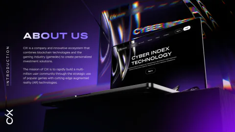
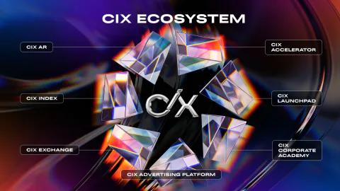
Cyber Index Technology is building an ecosystem around cryptocurrency: an exchange, an index, an accelerator, a launchpad, an academy.
All of it still on paper, and the job was to bring investors in. Hence the decks.
We decided to go in steps: the website first, then CIX TAP, and only then CIX AR.
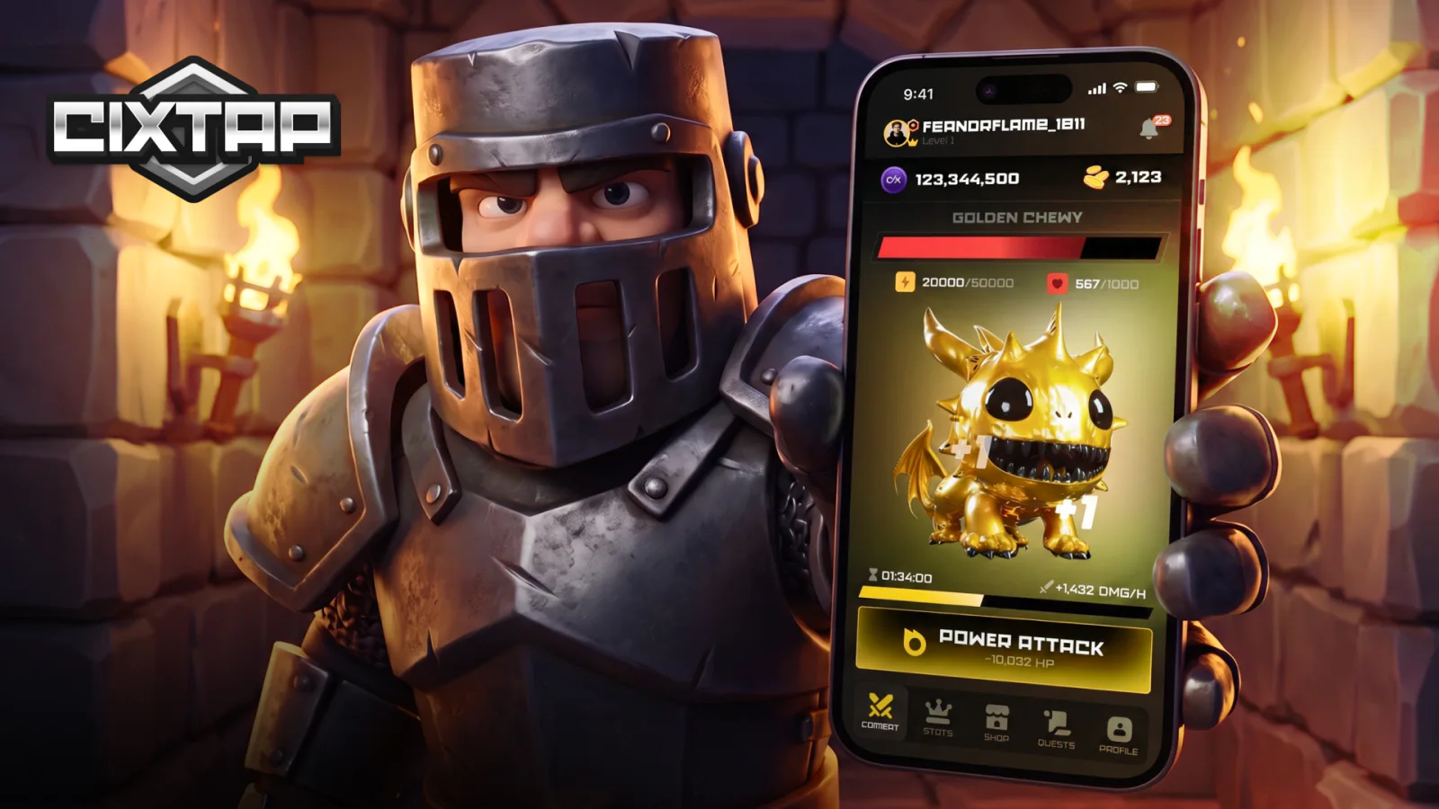
CIX TAP
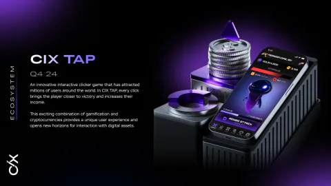
A clicker inside Telegram, the first product that actually shipped. Its job was to gather the audience we’d later show the game to.
Mechanics, screens, states, plus creatives for social media.
See the CIX TAP case
CIX AR
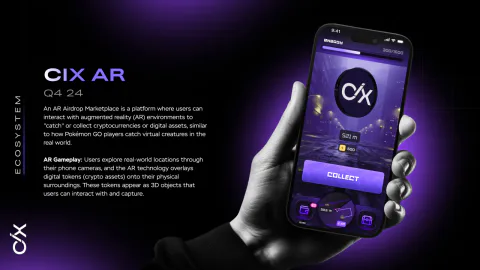
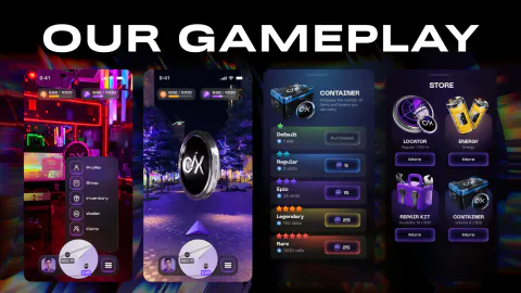
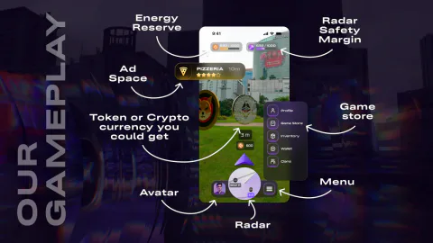
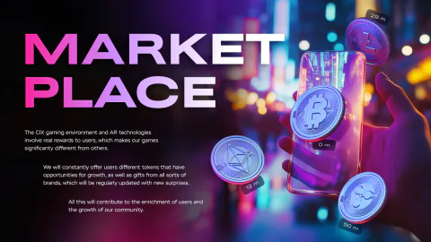
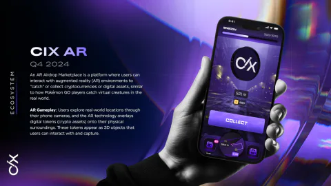
Roughly Pokemon Go, except instead of monsters there’s real cryptocurrency scattered around real places in the city. The CIX token and a referral programme sit on top.
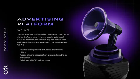
When the decks were being made the mechanic didn’t exist. No demo, no screenshots, not even a firm description of the gameplay, and we still had to explain it. That’s why we bet on 3D.
The guidelines came first
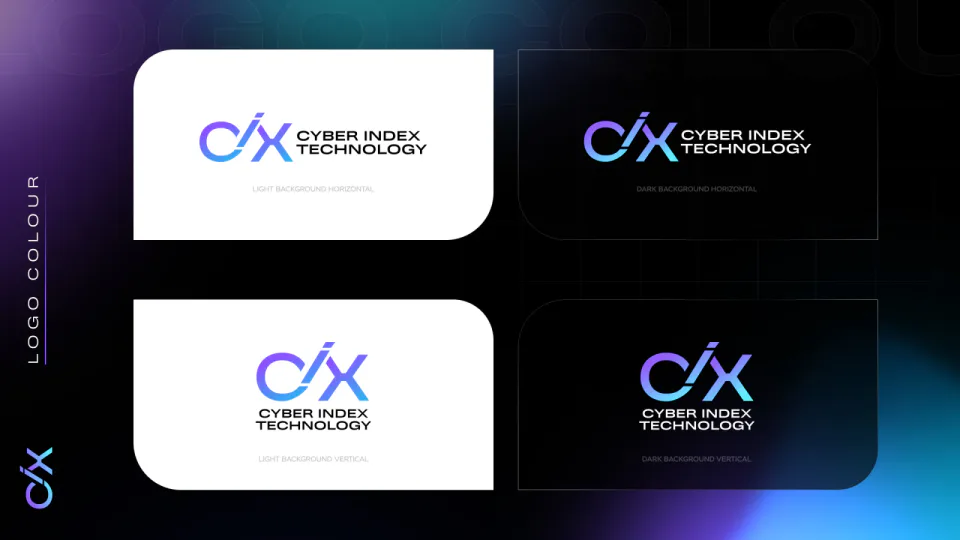
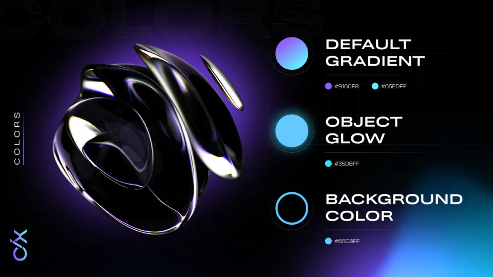
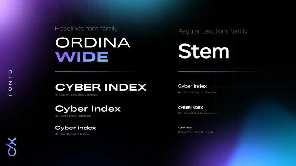
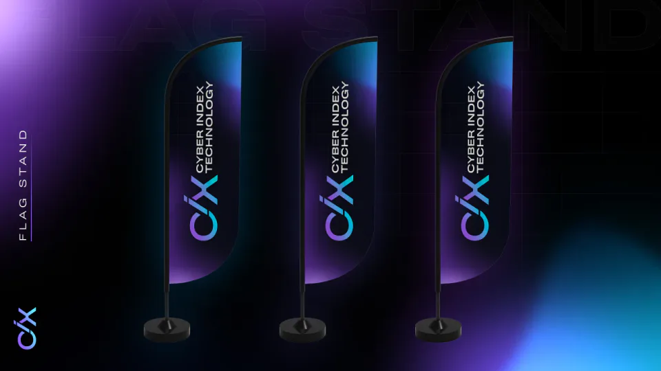
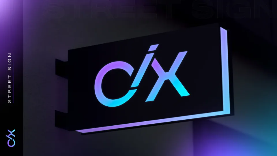
Before anyone wrote a line of code we put together the identity: the mark, the palette, the typeface pairing, how the gradient and the glow behave, and everything it goes on, from a flag to a street sign.
Everything after that got built off these pages, the decks included.


Websites for every direction
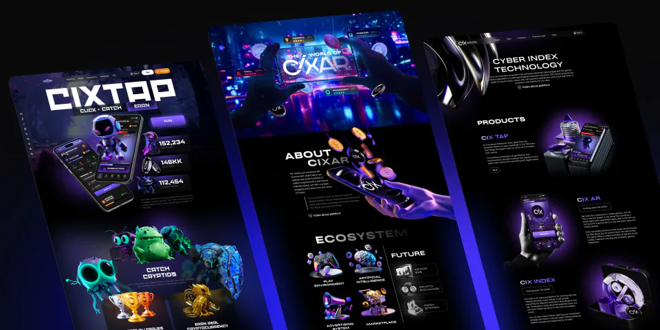
The ecosystem grew product by product, and each one needed a way in of its own: the company site, pages for each direction, landings for launches.
The presentation for the network
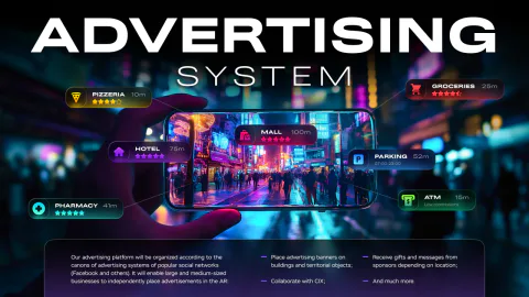
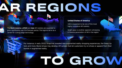
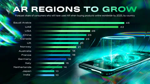
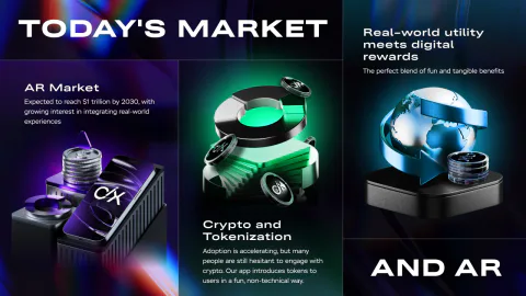
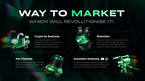
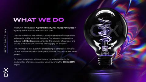
This deck is about the product itself and the market under it: what the game is, how it works, who you sell it to and why.
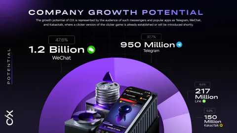
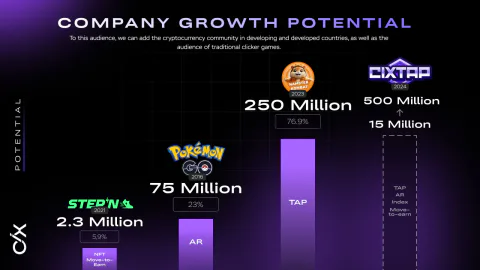
So half the spreads go on the mechanics and half on the numbers behind the augmented reality market. Twenty-one spreads.
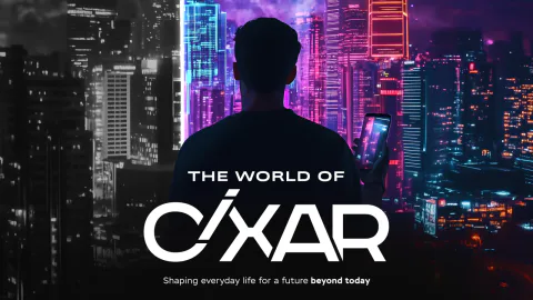


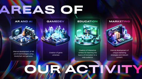
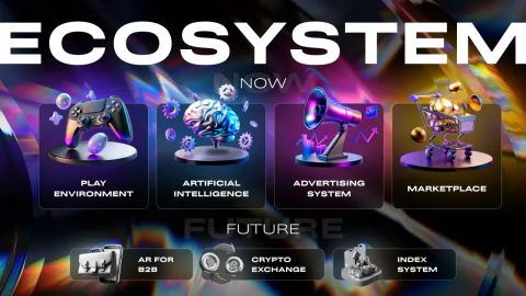

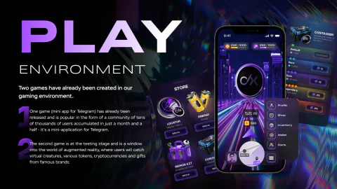

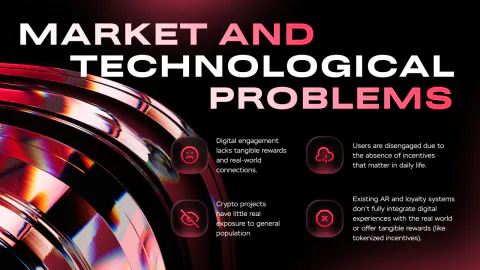
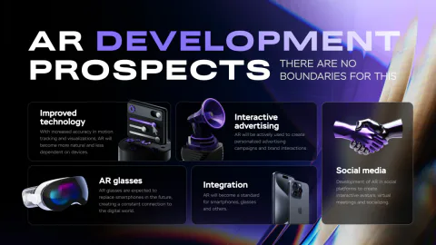
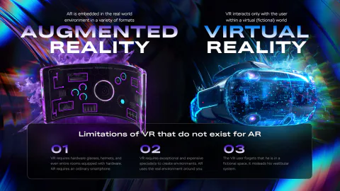
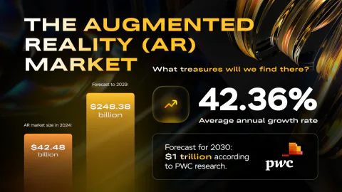

The presentation for investors
This one is about the ecosystem around the game, and the product line with its launch dates.
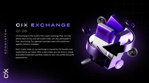
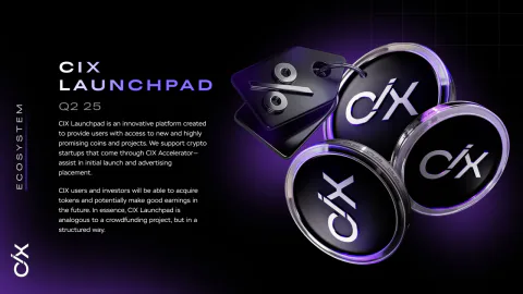
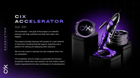
Here the game is one spread among many, next to the exchange, the index, the accelerator and the academy. Fourteen spreads, made in two languages.
The financial model, the tokenomics and the legal details aren’t here, they stay closed.
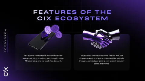
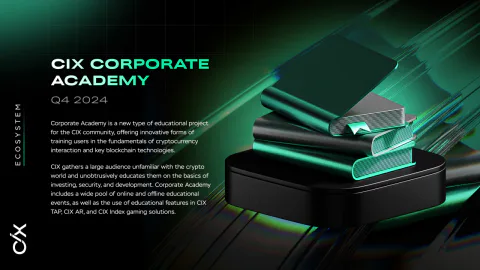
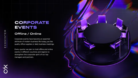
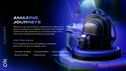
Both decks work the same way. Every spread is a composed frame: the object in the centre, the text off to the side, the colour of the object bleeding out into the background.
It costs more to make, but nobody knows this product, and you have to hold attention on every slide right to the last one.







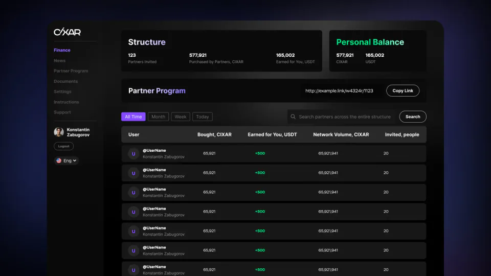
The referral dashboard
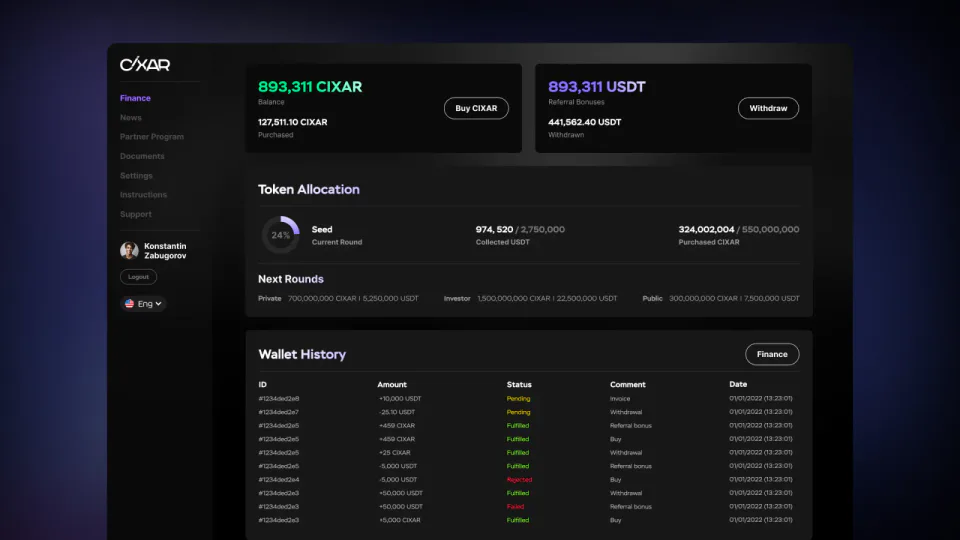
The economy the decks describe had to exist for real. Finance on the left, the affiliate programme on the right.
All the difficulty is in the states. A transaction has five of them, and one glance has to tell you whether you lost money or you’re simply waiting.
The CIX company deck
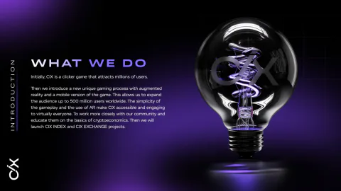
The broadest of the three. About the company as a whole: who they are, what already exists, where they’re going next.
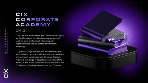
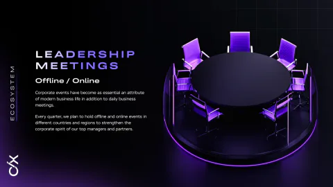
Every product in the ecosystem sits side by side here, from the clicker to the exchange and the accelerator, along with what the company does outside its products: the community, the webinars, the trips.
This deck moves evenly, with no sharp turns between subjects, so the palette stays the same across every spread. The other two work differently, the colour shifts with the subject there. Twenty-one spreads.