Solo, replacing the previous agency
Phygital Center
An MVP mobile app for the centres in a federal sports programme. The previous agency spent months on it and delivered nothing, so I designed it again, on my own, in a little over a month.
- Product design
- UI/UX
- Mobile interfaces

What the product is
A federal programme overseen by the sports ministry and tied to the Games of the Future: a network of centres where physical sport and esports stand side by side. Five-a-side football, basketball and volleyball next to FIFA and CS, and you develop in both directions at once, in whatever proportion suits you.

What phygital means
The word is two words stuck together, physical and digital. Real sport and esports pulled into one discipline and one building.
You play a FIFA match, walk out onto the pitch in the same building an hour later, and your progress counts both halves at once.
The client arrived in a panic
The previous contractor had been at it for months with nothing to show. They needed an MVP, but a substantial one, enough to get a centre open.
I did it on my own, in a little over a month. This is 2022 work, shown as it was.
What I did
Pulled the requirements apart from scratch. There was no architecture to speak of, so I sat down with someone from the client team and went through every box on the flow chart they’d brought.
Roles and progress for a physical athlete and an esports player in any chosen proportion, achievements, quests, rankings.
The economy and the booking: wallet, booking for one person and for a team, invitations, payment.
The empty state and the full one. The empty screen is the one people actually meet first.
The centres
The programme is federal and the centres are going up all over the country. The app was designed for those buildings, so this isn’t only screens.
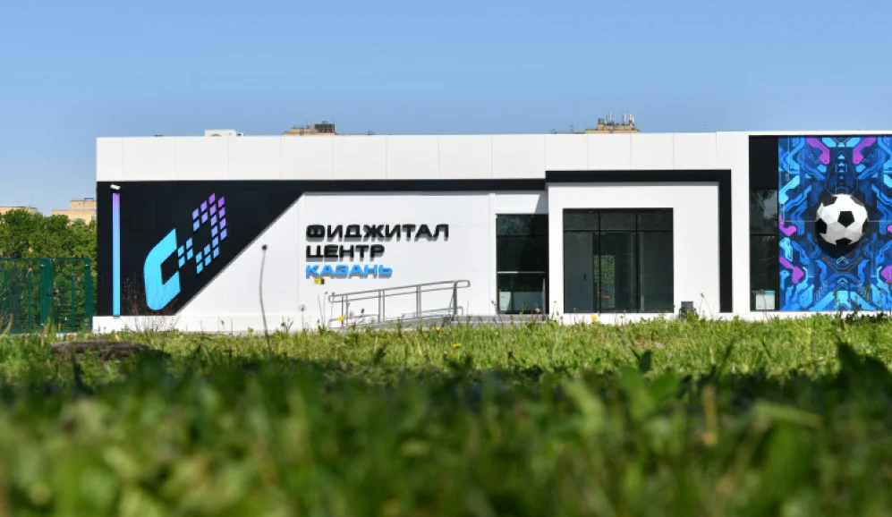
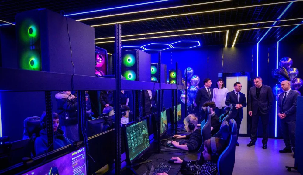
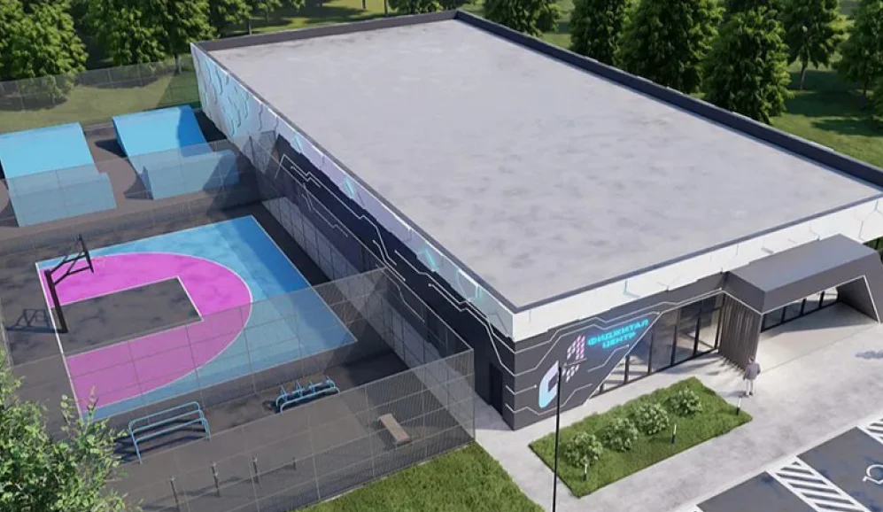
Some of the centres are already standing, some are still renders. Inside they’re the same: pitches for football, basketball and volleyball, an esports hall next door, and one person using both in an evening.
- 60regions on one platform
- 20k+athletes in the ecosystem
- 450+events run through the platform
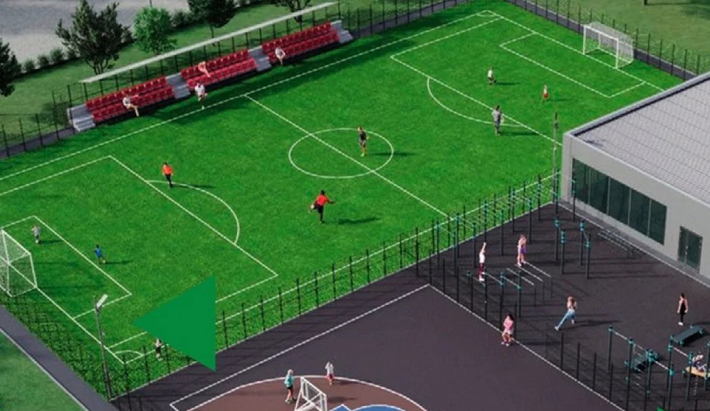
From chaos to a working MVP
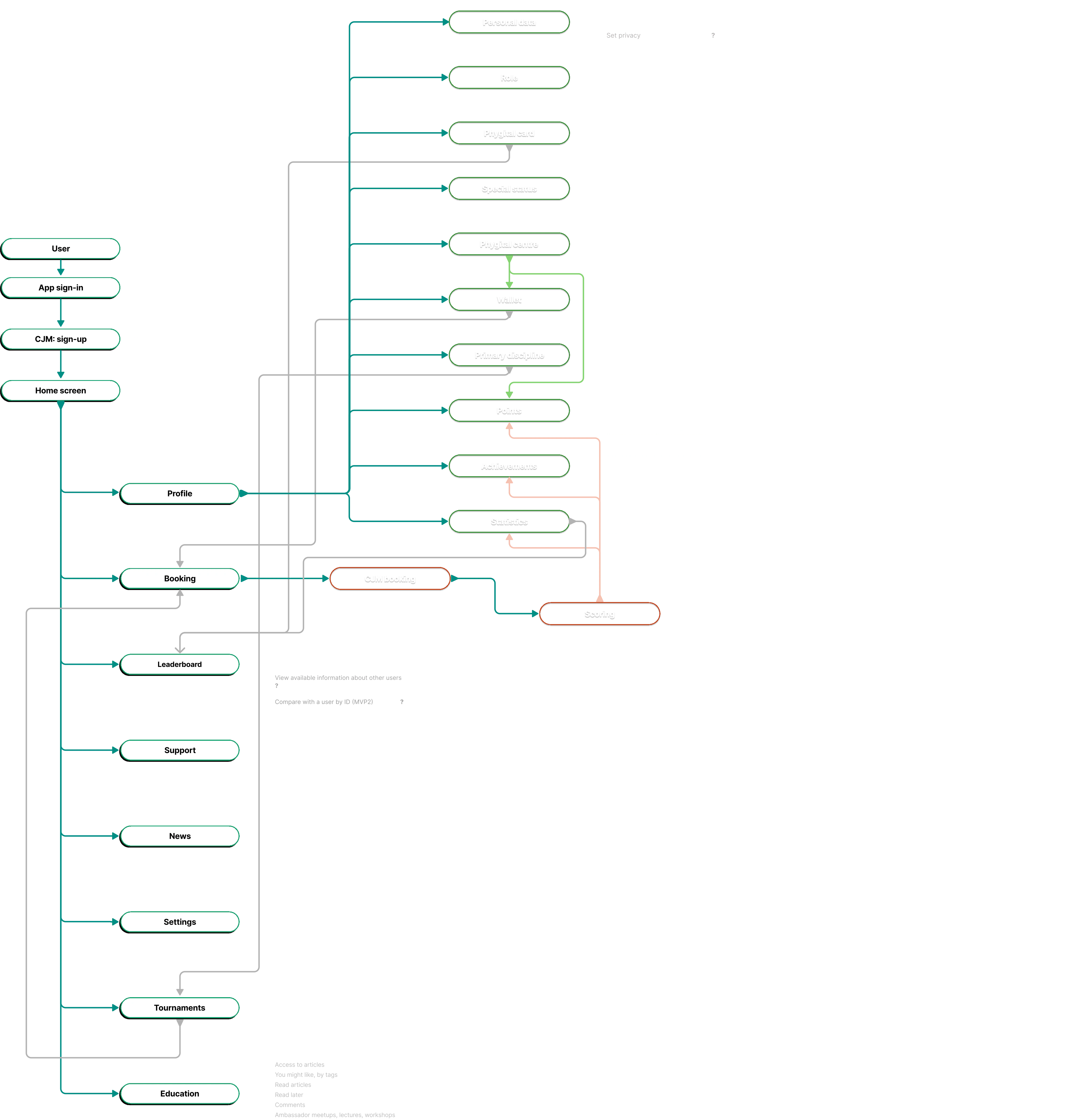
There was no up-to-date product architecture. They handed over a flow chart with plenty of words in it and no meaning, so I sat with someone from the client team and took it apart box by box.
This happens on project after project: the domain knowledge lives in people’s heads, and the only way to get it out is by talking. What came out of those conversations is the real artefact of this case, the screens come second.
The map zooms and drags. Click it first, then the wheel works.
- 70screens in the MVP
- 50+mechanics and scenarios
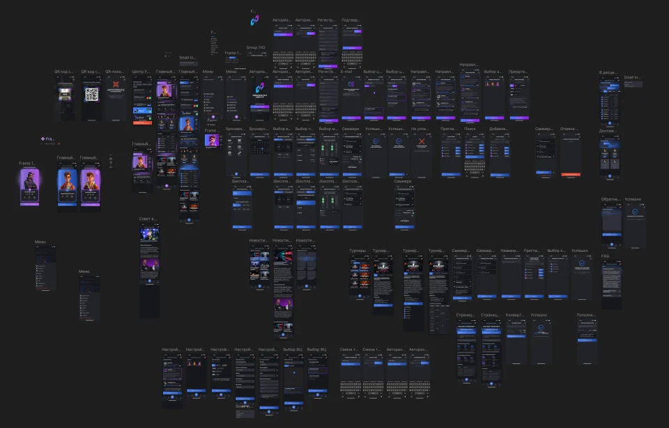
Click to zoom with the wheel
Seventy screens
The whole MVP on one sheet. That’s how many screens it took to get a centre open: roles and progress, achievements and quests, booking, wallet, tournaments, settings, empty states.
Sign-in and registration
You come in by phone or by email, and it’s the same path run twice. The first screen is shared, then it splits into pairs: phone on the left, email on the right.
The third button is the Phygital ID. The order follows what people actually use: phone gets the big button, the ID comes second, email is a line with no button at all.
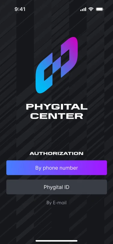
Three ways in, and they aren’t equal. Both paths below start here.
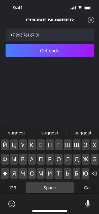
Phone. A number and a code; there is no password on this path.
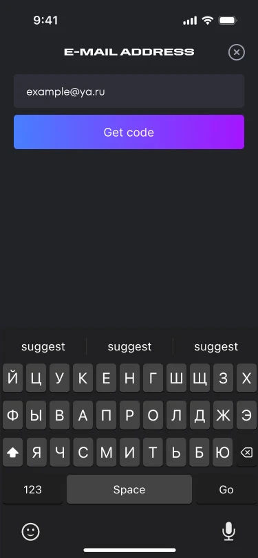
Email. The same screen, a different field.
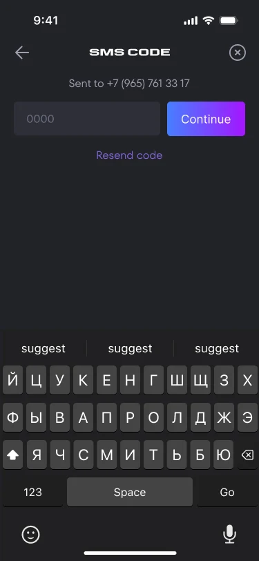
The code from the text. Resend sits next to the field.
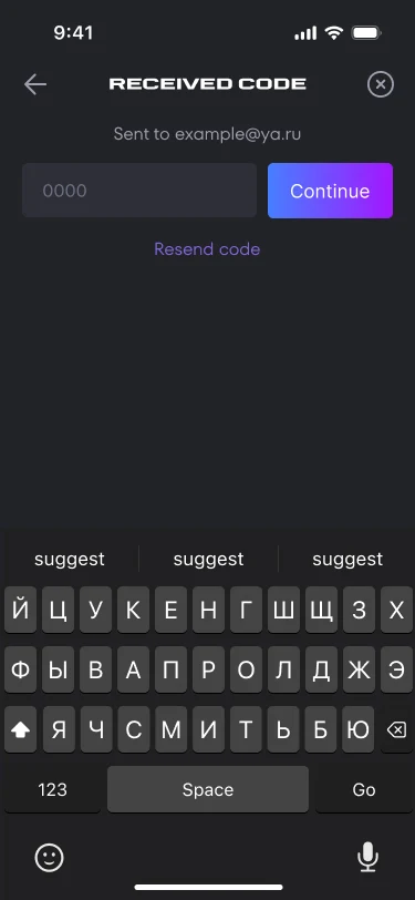
The code from the email. It repeats the phone screen; only the line on top changes.
Registration and the second channel
The two registration forms differ by exactly one field, and afterwards each of them collects the channel it’s missing. However somebody came in, the centre ends up with both a phone number and an email.
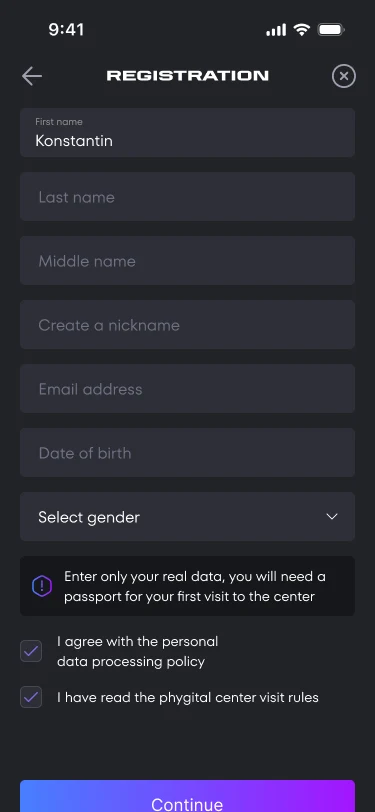
Came by phone: the form has an email. Plus the warning inside the form: on a first visit the details are checked against a passport.
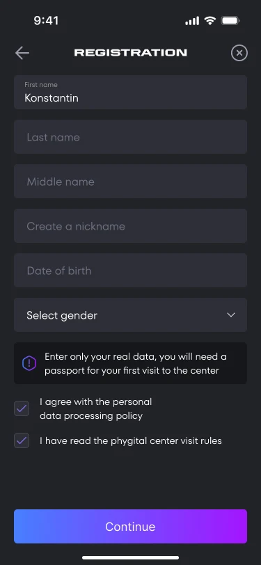
Came by email: no email field. It is already known, so asking twice is pointless.
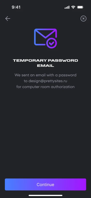
The email earns its keep in the computer hall. A temporary password goes there for a club machine: the app lives on a phone, and half the centre is an esports hall.
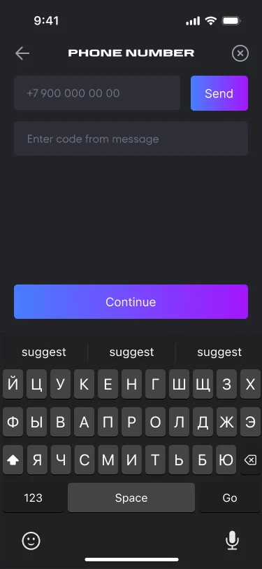
The phone is confirmed after the form. Field and code on one screen: the step is plumbing.
Centre, direction, disciplines
Registration doesn’t stop at the form. Next you pick a centre, set how much of you is physical and how much is esports, mark your disciplines and choose an avatar. That’s the roles and progress from earlier, met right at the door.
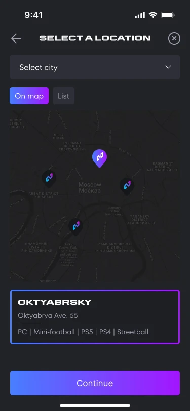
Map and list are one choice shown twice. A centre is looked up by where it is and by what is inside it: the line-ups differ.
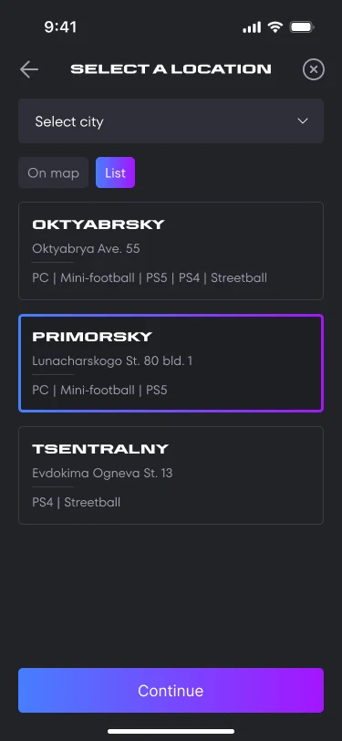
The list is for when the map doesn’t help. What decides isn’t distance but whether the right court is there: PCs, five-a-side, PS5, streetball. The card carries both the address and the line-up.
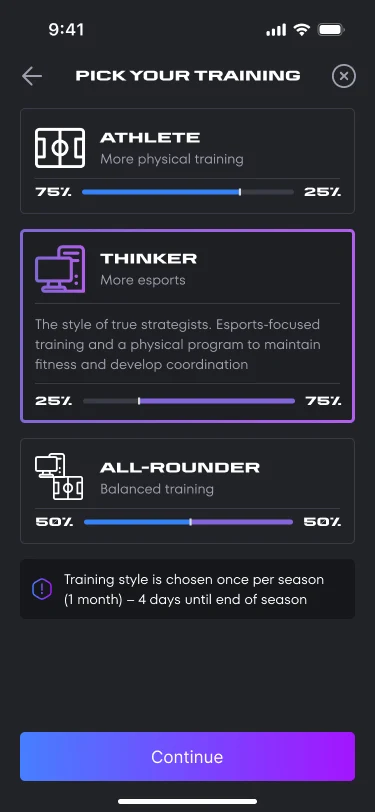
The proportion, turned into a screen. Physical, Brain, All-rounder: 75 to 25, 25 to 75, or even. The direction is chosen once a season, and the deadline sits right there so the choice doesn’t read as permanent.
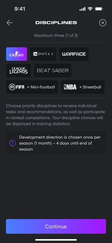
Disciplines come in pairs. FIFA with five-a-side, NBA with streetball. Three at most: quests and rankings hang off them, and picking everything would hollow out both.
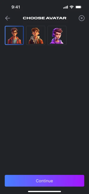
An avatar from three presets. No uploads in the MVP, which also means no moderation queue. A person still has a face from day one.
The main screens
The profile takes its colour from the direction: purple for the Brain, blue for the Physical. That colour carries through to the card people share.
Notifications push the content down. They land inside the same screen instead of floating over it, so an invitation to the computer zone gets accepted or turned down right there in the feed, without going anywhere.
The phygital card is built to be screenshotted. Handle, team, age, achievements, points. This is the part people share, so it has to survive outside the app.
There are three directions and the sheet shows two. The third is the All-rounder, split down the middle, and its profile works the same way.
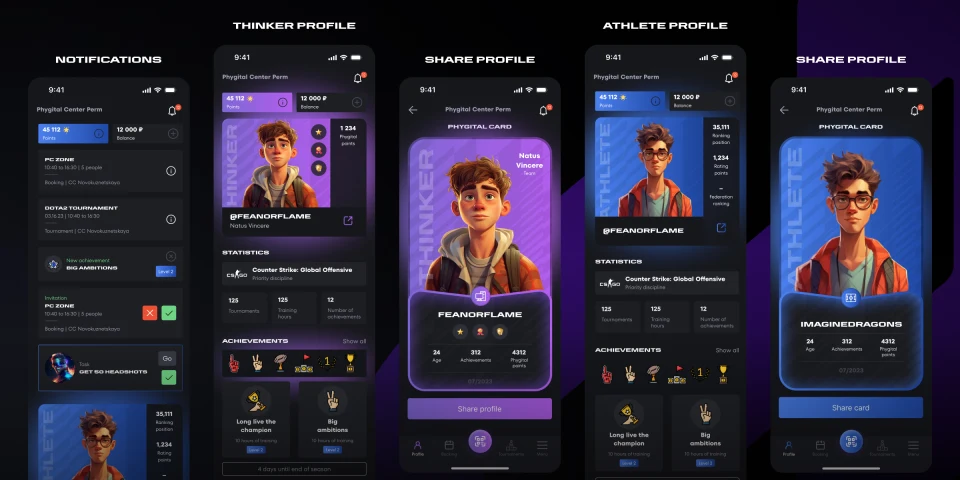
Getting into the hall
When we were designing this, nobody had settled how you actually get through the turnstile. So I drew both routes: the phone reads the code on the turnstile, and the turnstile reads the code on the phone. Which hardware the centres would end up with was a question for later, and the mockups were needed now.

Not active yet. Before the first visit the code does nothing: an administrator verifies the account against a passport. The screen says what to go and do, not that something went wrong.
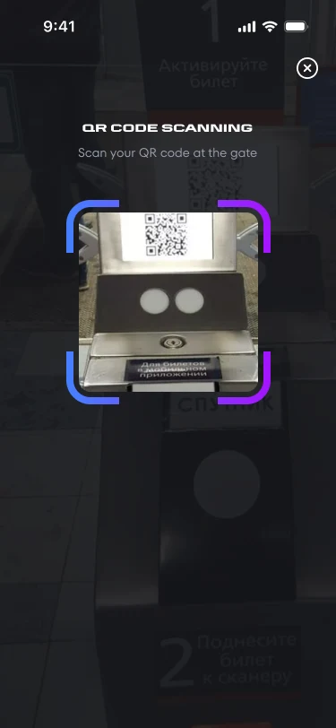
The phone reads the turnstile. A framing overlay on the live camera, then through you go.
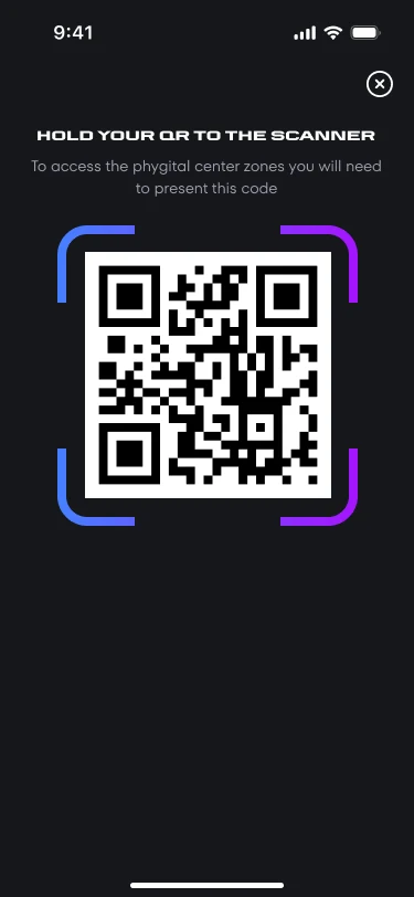
Or the other way round, the turnstile reads the phone. Same entry, opposite direction. The second option cost one screen and removed a dependency on hardware nobody had chosen.
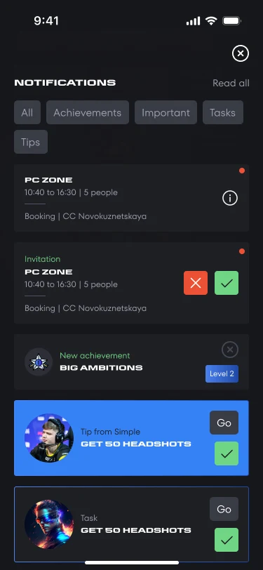
Notifications are sorted by kind. An invitation is accepted or declined on the spot, a booking reminds you of itself, a quest and a tip lead inward. Filters on top, because mixing these into one feed helps nobody.
Booking
Zone, date, time, package, seat. You take time by the minute or in blocks, and seats one at a time or several at once. Several means a team of your own: a five-person bootcamp, or a whole pitch for twelve.
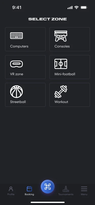
Zones in one menu. PCs, consoles, VR, five-a-side, streetball, workout. Half digital, half physical, chosen from a single list.
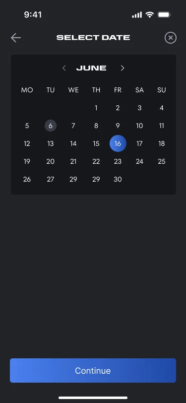
The date is the same everywhere. Up to this step paid and free centres behave identically; after it they part.
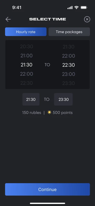
By the minute. Start and end on dials, with the price and the points underneath.
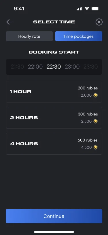
Or in blocks. One, two, four hours, for people who would rather not count minutes.
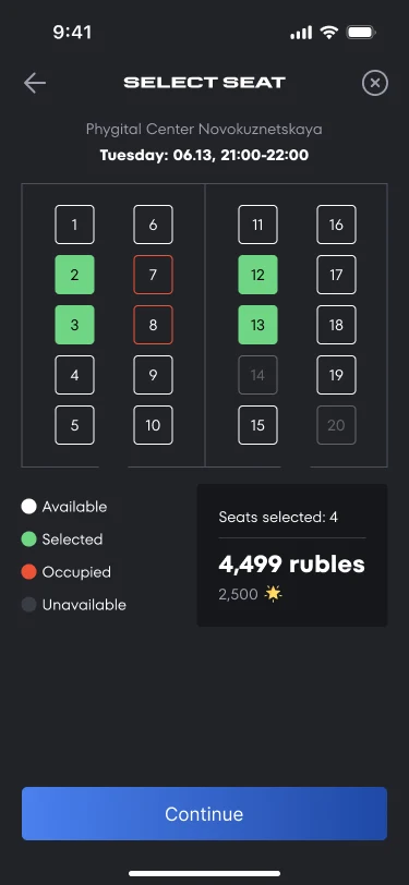
A seat, or several. Taken in red, free in white, chosen in green. The tally sits underneath: how many seats and what they cost.
Paid centre and free
Centres come paid and free, and that isn’t two different apps. It’s one screen, and the only difference is money: in one case there’s some, in the other there isn’t.
I never drew a separate mockup for the free centres. Same step, same order, same elements, some of the data simply never turns up.
Paid: a block with a price. Every block of time carries a price and the points it earns.
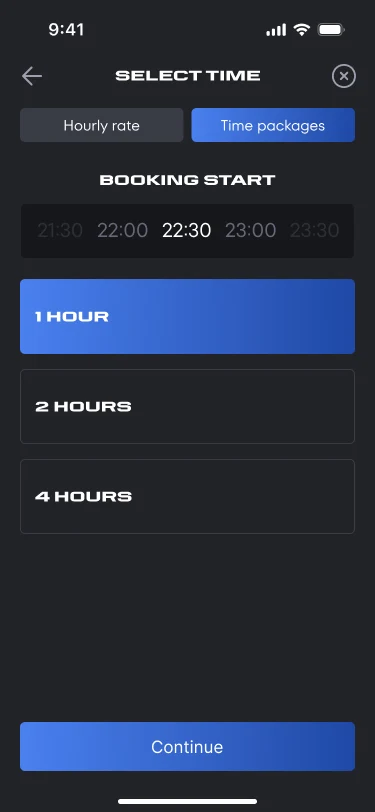
Free: the same block. Duration and the choice itself are what remain.
Paid: a seat with a tally. The sum and the points for the booking sit at the bottom.
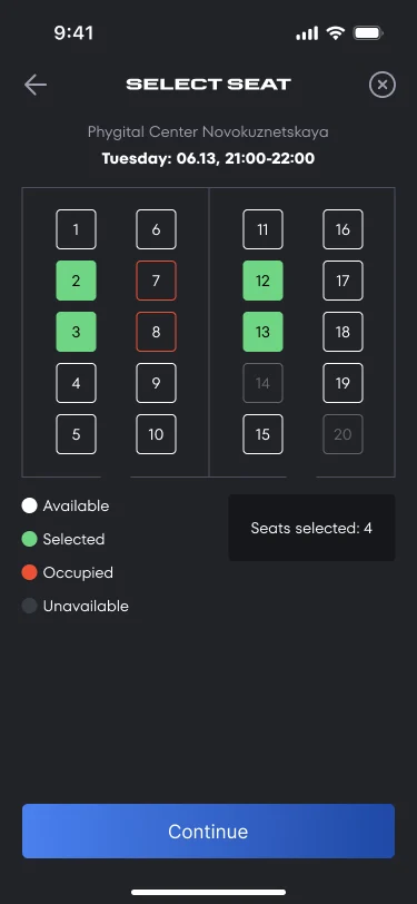
Free: a seat with no tally. Only the seats themselves are counted.
Checkout
There’s one summary screen and it assembles itself differently every time: paid centre or free, a single seat or a whole pitch. Plus two outcomes, because payment doesn’t always go through.
Payment comes from three places at once. Account, points and card are toggles rather than a single choice, so part of the sum can go on points and the rest on a card. The points rate is written next to the toggle instead of being buried in the rules.
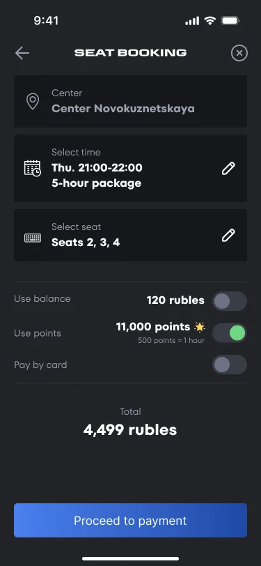
Paid centre. Centre, time, seats, and beneath them three payment sources and the total. The button leads to payment.
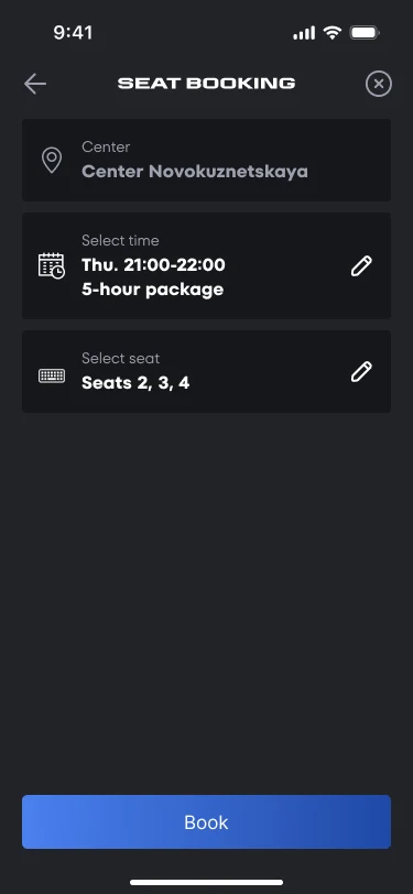
Free centre. The top is the same, the payment part is gone entirely. The verb on the button changes too: book, not pay.
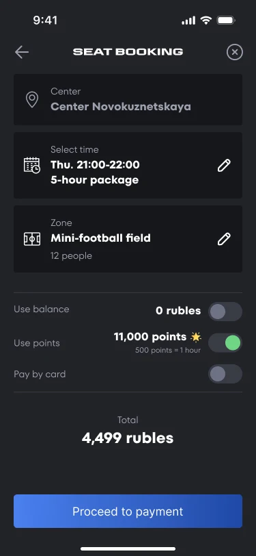
A whole pitch instead of seats. The seat line becomes a zone and a capacity, twelve people. The rest of the summary holds.
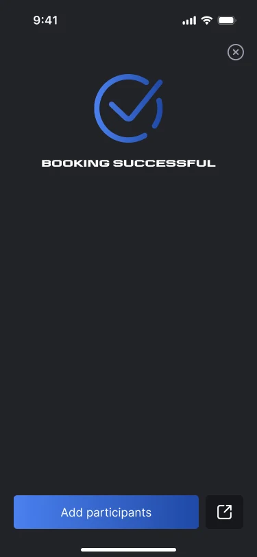
The team starts here. People are invited after the booking, not before: first the slot is held, then the players gather around it.
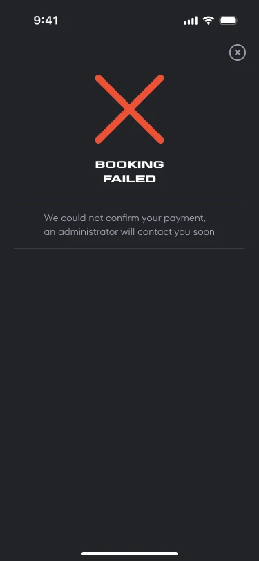
It failed. The screen says what happened and who’ll be in touch. Without it someone books again and pays twice.
Who joins the booking
Book a whole pitch or a row of machines and you then have to fill it. You find people by handle, the one they invented at registration.
The seat counter stays visible the whole time you’re searching. One of twelve added sits above the field, because the capacity came out of the booking: you invite as many as you paid for.
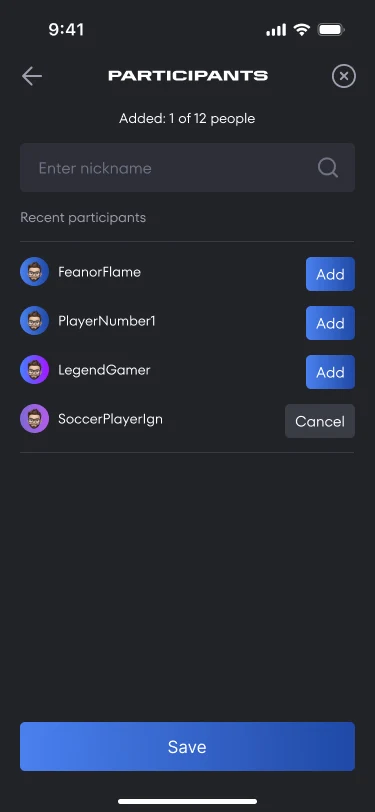
Recent people first. The list opens on those you have played with: line-ups repeat more often than they change, and there is nothing to search for.
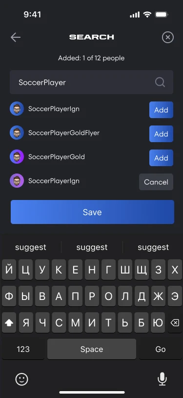
Search by handle. The handle is the identity here: the centre needs a phone and an email, players know each other by name.
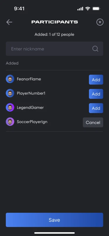
The added ones collect in place. Each button flips to cancel, and the whole line-up stays visible until it is saved.
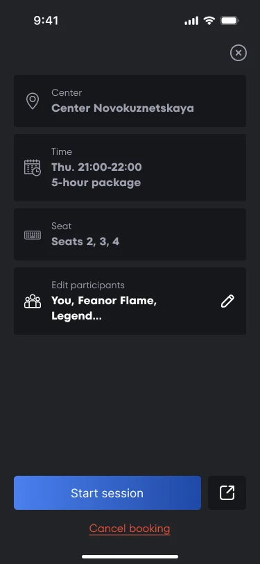
The booking with its line-up. Opened from a notification. From here the session starts, the participants change and the booking is shared.
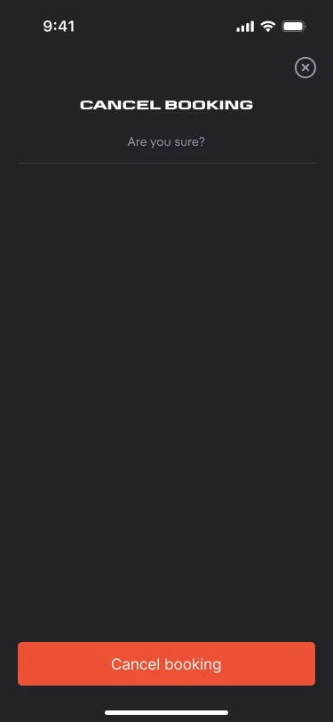
Cancelling gets its own screen. The action can’t be undone and it hits everyone invited, so it asks rather than sitting in a row of buttons.
The shared pages
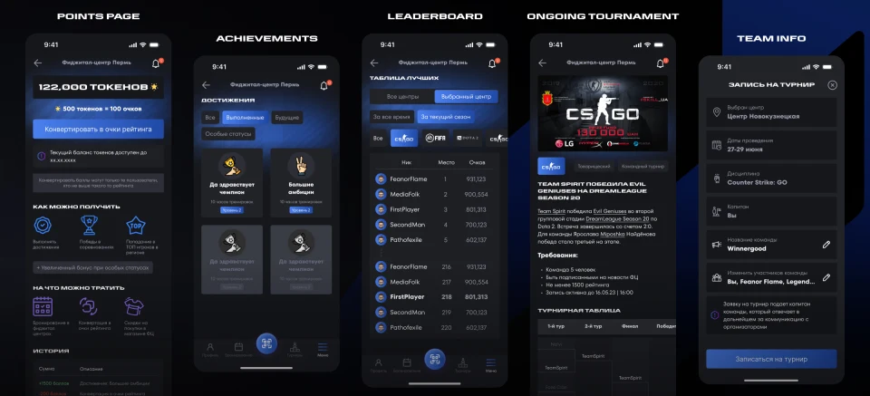
Points, achievements, the leaderboard, a tournament and a team. These aren’t steps along a route, they’re places people come back to, so they go on one sheet.
Points carry their rate and their expiry. Five hundred tokens for a hundred rating points, the date the balance dies, and the catch: not everyone can convert, you need the rating. All of it on the screen instead of in the rules.
You’re always somewhere on the leaderboard. The top places first, then your own stretch of it with your row inside. A table you can’t find yourself in isn’t worth reading.
A tournament keeps its requirements right next to the sign-up. A team of five, a rating of at least 1500, the deadline. If you’re going to be turned down on any of those, it should happen before you apply, not after.