Game mechanics, states, characters, design system
A space game where half the work is states
A space clicker. You build a station and a battleship, fight galactic creatures and collect Galaxy Points. Five tabs on the surface, with all the upgrading, exploring and economy underneath.
- Game UI
- Design system
What I did
The game interface and the design system behind it. Screens, states, the look of every mechanic, the characters.
The game runs on loops, so you can’t describe it by listing pages. Most of the work went into the states of screens that already existed.
What the game is
You build up a space station and a battleship, then fight galactic creatures and earn Galaxy Points off them.
From there you can grow three ways: level up combat skills, go out on discovery runs for ship energy, or put money into the workshop for passive mining.
It all points at the airdrop at the end, which is why the points get counted seriously.
Five tabs
From outside the game looks simple. Station, battle, discovery, workshop, friends. Everything else lives inside those five.
Which sets the main job. There are a lot of screens and only five ways in, and nobody should get lost between them.
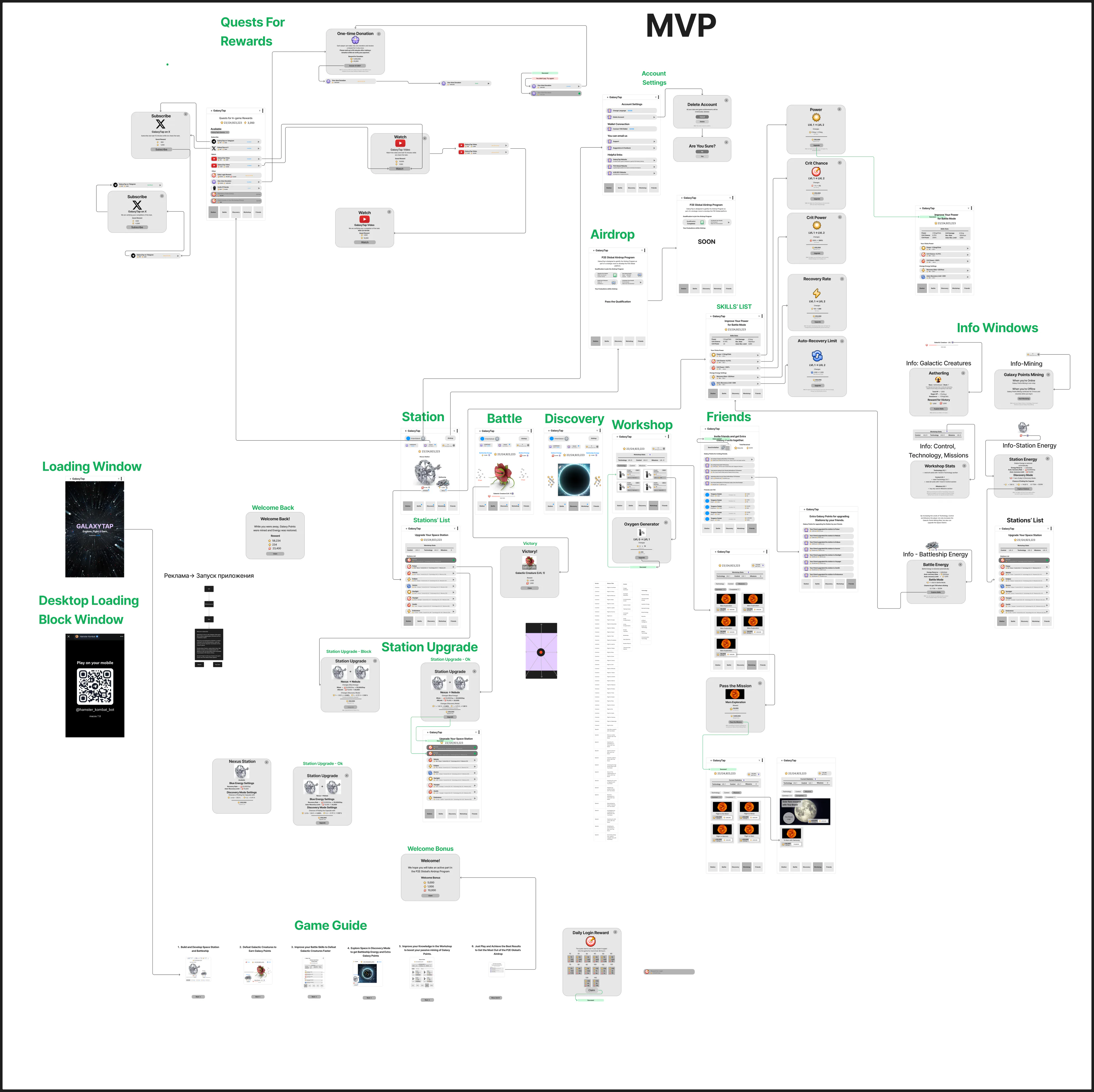
The screen map
The whole MVP map. Onboarding with its guide, quests for subscriptions, account settings, the skills list, station upgrades, info windows, the airdrop.
The map zooms with the wheel and drags with the mouse, because nothing this size is readable otherwise. Click it, then use the wheel.
Click to zoom with the wheel
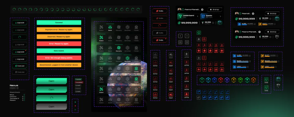
The component library
The library lives away from the screens. Every element is kept with all its states at once, whatever form it happened to take on any one mockup. Buttons, notifications, energy meters, station badges, battle icons, the tab bar, a frame-by-frame loader.
Buttons. Default, unavailable, with a notification dot, and a separate one for loading. Loading is a state of the button here, nobody throws a spinner on top of it.
Notifications. Three colours cover every case. Green, it worked. Orange, try again. Red, it didn’t. You read the colour before you read the words.
The tab bar. Drawn for all five tabs, plus the versions with unread dots. It sits on every screen, so any slip in it shows up everywhere at once.
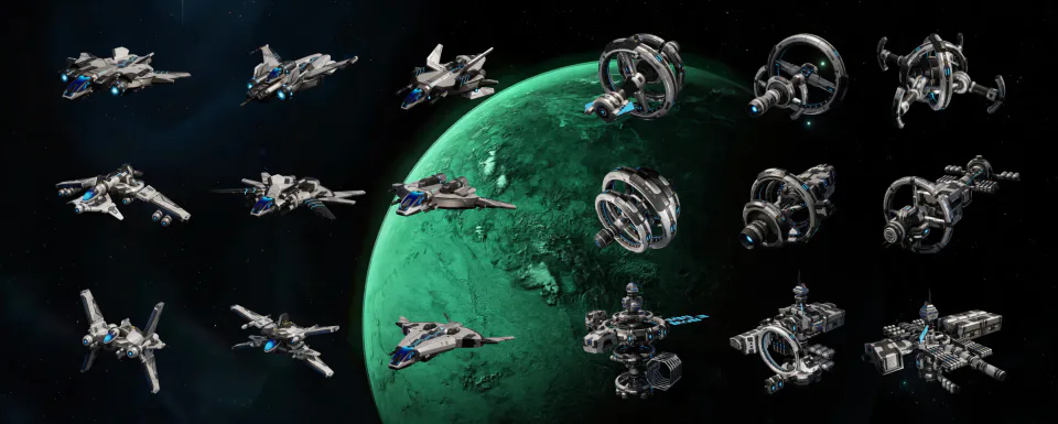
The fleet and the stations
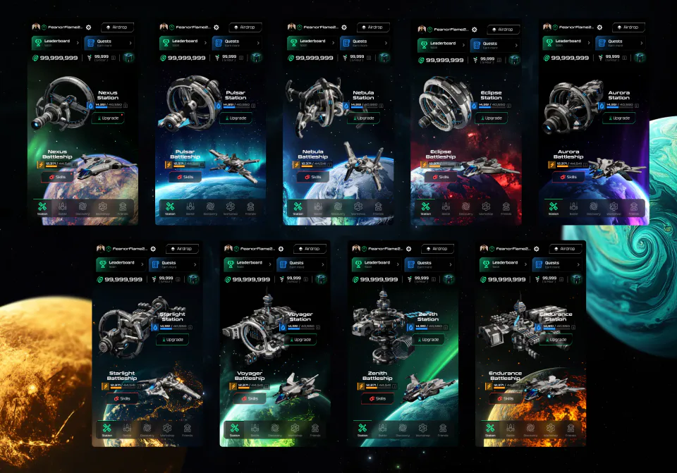
Nine ships and nine stations. That’s the upgrade ladder. Every step up is a new model, so players watch themselves grow instead of reading a number in the corner.
Where they came from. We bought the models ready-made and took them further with a 3D artist. Renders, assembly, colour grading.
Where the work actually was. Getting eighteen models to look like one family. One material, one pair of colours, one light, one camera angle. Otherwise two upgrade steps side by side look like they came from different games.
The main screen at every step
All nine frames are the same main screen after each upgrade. Raise the station and the ship, and both of them change, along with the planet behind them.
So progress shows up where players spend most of their time, with no separate statistics window. Nexus, Pulsar, Nebula, Eclipse, Aurora, Starlight, Voyager, Zenith, Endurance.
Upgrading the station
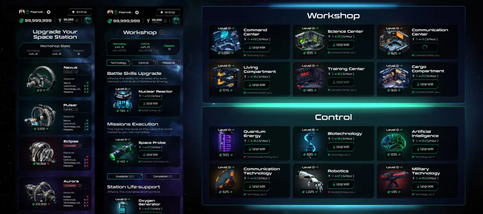
Buying the station isn’t enough. On top of the coins you need technology branches levelled up, and the requirements are listed right on the station card, with ticks against whatever’s done.
A branch level is the lowest item in it. For technology to count as level three, every item inside has to be at least level three. One straggler holds the whole branch back.
Branches pay you back. Every upgrade adds to the passive mining rate, so whatever you spend on the requirements comes back as income.
Upgrading the ship
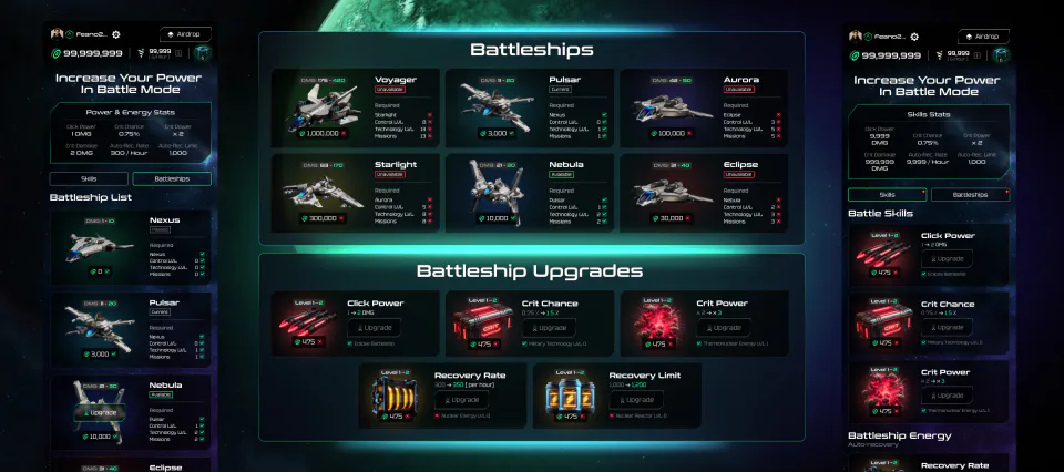
The other half of the same economy. The station feeds you, the ship does the hitting, and they’re built the same way, they just pay out for different things.
What gets upgraded. Five combat stats: click power, crit chance and crit power, recovery rate and recovery limit. Each one tells you what it was and what it’s about to be.
The branches are locked together. A new ship asks for levels the way the station does, and its upgrades lean on particular station technologies as well. Neither one grows without the other.
Discovery, tap the asteroids

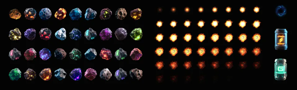
Discovery is the second source of resources. Rocks fall from above, you hit them, and coins and energy drop out.
What it costs. Discovery burns ship energy, so it’s a trade: you spend one kind of energy to mine another.
Why it exists. Whatever you collect goes into Battle, where that energy gets spent on monsters. Discovery is how you get ready for the fight.
What it’s made of. Thirty-nine rocks, an explosion of about fifty frames, and two canisters, green for points and orange for energy. The canister isn’t a separate layer, it’s drawn into the last frames of the explosion.
On the left is a screen put together on this page, no video involved. It shows the mechanic, you can’t play it.
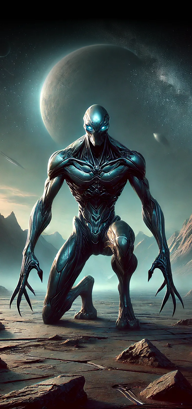
One creature, evolving
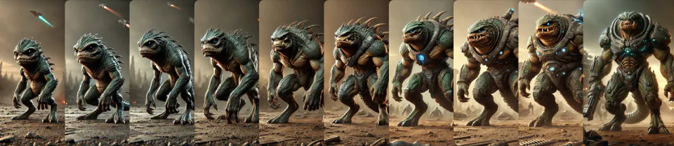
You spend a long time hitting monsters, and the same enemy wears thin long before the game does. So each of them has an evolution.
The steps run in order, simple to heavy. The silhouette stays recognisable while the armour, the colour and the detail change, so you can see the enemy growing without being told.
About a hundred creatures
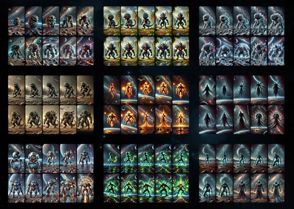
Around a hundred monsters in the Battle section. You need that many so the progression doesn’t run out before the player does.
There are a few less in the frame. One didn’t fit, but the grid came out even.
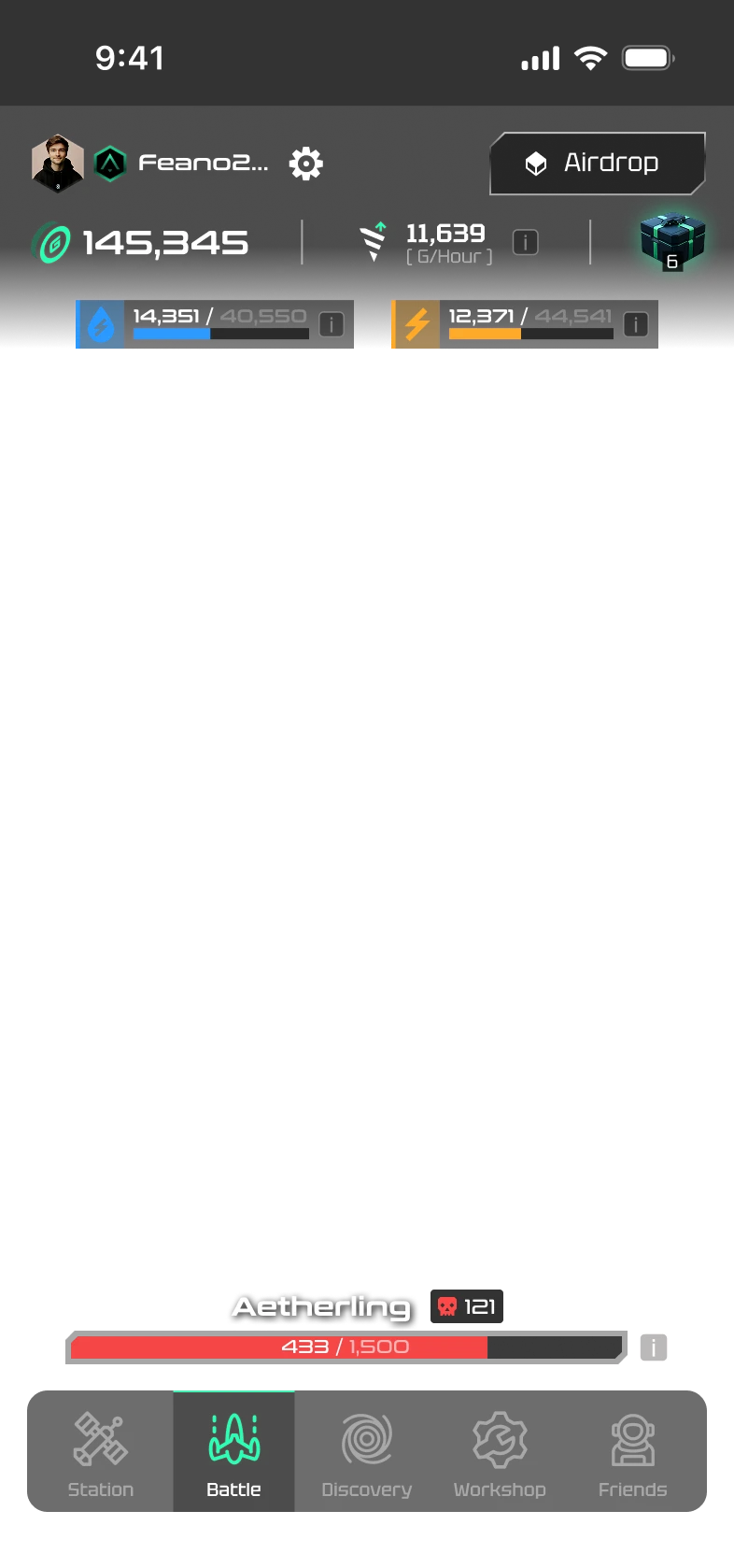
The Battle mode
The prototype is interactive, click the monster
A fight rests on a single action, so how it answers matters more than anything else. Three things respond to a tap at once.
The heat. The faster you hit, the redder the edges of the screen go. Stop, and the red drains away. It’s the only way to show tempo without drawing a counter.
The crit. Every few hits a red texture flares across the screen and the number lands big, with a label. A rare event has to look like one.
The damage numbers. They scatter from wherever you tapped and fade out. Set in the game’s own typeface.
Social and the airdrop
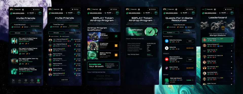
Everything you do with other people lives here. Friends, quests, the leaderboard and the airdrop that the rest of it is for.
Friends. You get a bonus for the invitation, for a battle your friend wins and for the points they mine. Three reasons to bring people in instead of one.
Qualification. The airdrop screen gathers scattered actions into one checklist with a single verdict, passed or not. Until you pass, you can see exactly what’s missing.
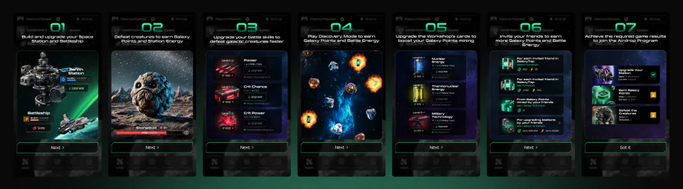
Onboarding
Seven steps before the first hit. Each one explains one thing and shows it as a screen, with no wall of text beside it.
The order follows the game itself. Station and ship first, then the fight, then discovery and the workshop, and only at the end the airdrop the whole thing is for.
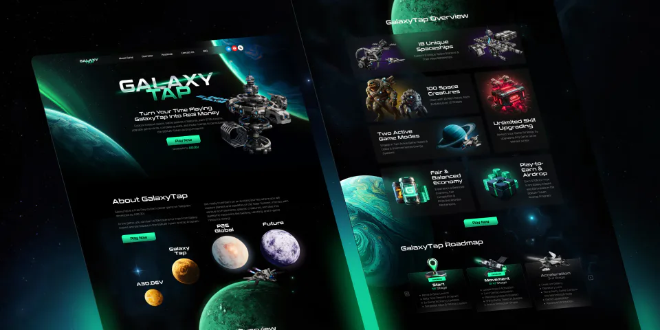
A landing page before launch
Before the game launched we put together a landing page. It explains what the project is and gives a way in to anyone who didn’t arrive from Telegram.