
A month from zero to production
Broker
A prop firm was launching a regulated broker of its own. I had a month, and the brief listed what the site needed without saying how any of it actually worked.
- Product design
- UI/UX
- Domain research
What the product is
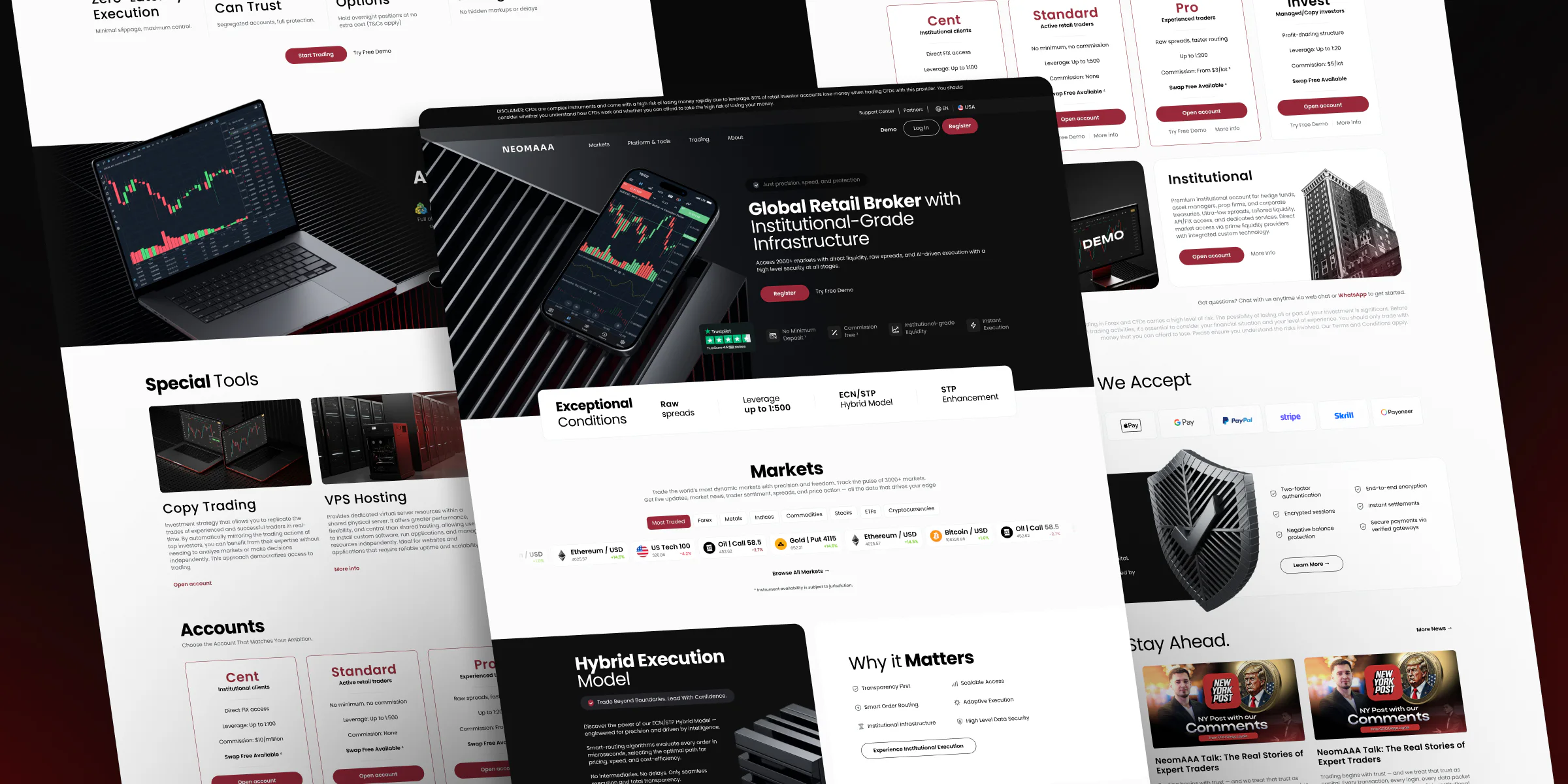
A prop firm was launching a regulated broker of its own: a step out of prop trading into a financial product that plays by its own rules. I had about a month.
What I did
I didn’t write the site structure brief, I worked from it. It told me what had to exist, but never how anything was calculated or where the numbers came from. That was my half of the job.
How we worked
Gleb and I split it. I took the competitor research, the architecture, the data requirements and most of the screens.
We ended up with a few dozen pages, a component library and about sixty screens, all handed to development and shipped.
The site’s live. It has moved on without me since: the account types running today aren’t the ones in the brief.
Taking the market apart
I went through about twenty competitor sites, with exness as the benchmark: calculators, account types, how order execution gets explained, what carries trust.
The job wasn’t to see how other people do it, it was to decompile the mechanics: how someone else’s calculator arrives at a number, where it pulls data from, which parameters actually move the result and which are there for show.
The arithmetic is sound everywhere. The interfaces are nothing alike: two tabs in one place, six switches in another. I picked the one that doesn’t disagree with the maths of our own product, not the one that looked better. You can’t lift someone else’s form, there’s a different pricing model behind it, and you end up with an interface that asks about things that change nothing and says nothing about the things that decide everything.
Here’s who I went through, and what I was after in each.
| Competitor | What I looked at |
|---|---|
| exness | Security and client protection, VPS hosting, currency converter, market analytics, pricing, social responsibility |
| blackbull | TradingView, copy trading, swaps on Islamic accounts, referral programme |
| ig | Forex, charts, institutional accounts |
| thinkmarkets | TradingView, account types, contract specifications |
| interactivebrokers | Platforms, sign-up and demo accounts |
| oanda | VPS hosting, trading hours |
| capital | Currency converter, how a price is formed |
| Competitor | What I looked at |
|---|---|
| xtb | Market analytics, invest account |
| fxpro | CFD calculator |
| fundednext | CFD calculator |
| xm | Market analytics |
| icmarkets | Account types |
| fbs | Deposits and withdrawals |
| fnmarkets | Deposits and withdrawals |
| trackdesk | Pages that compare them with competitors |
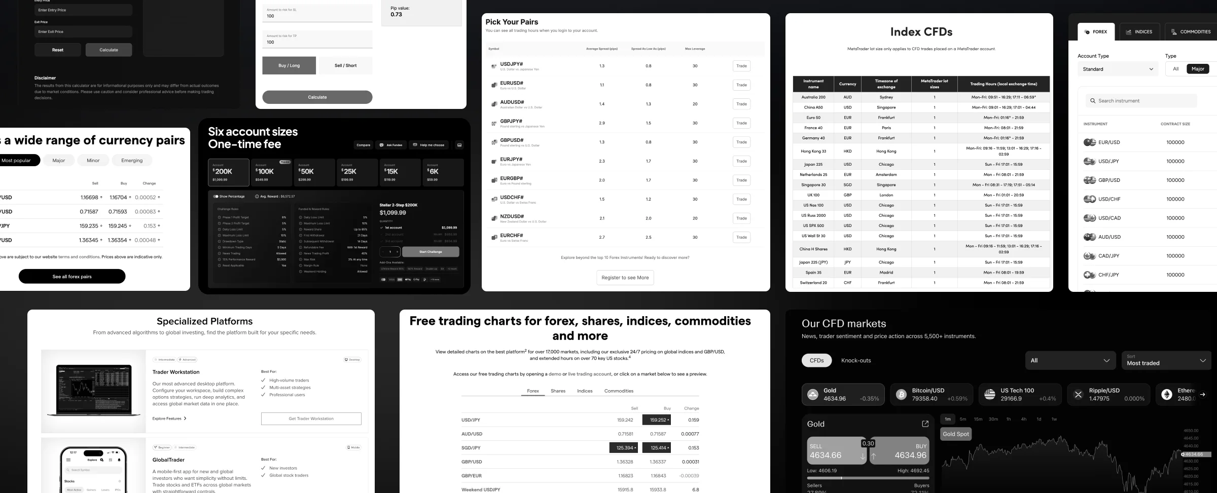
Fragments of those very pages.
Three kinds of decision

Take as is
Industry patterns you’d only hurt yourself by breaking. Recognition beats originality. PCI DSS certification came in that way: I saw how the market leader presents it and didn’t invent my own language for the safety of someone’s money.

Fix
Mechanics kept, readability reworked. The economic calendar: responsiveness, separators, accents.

Bring in from outside the industry
Comparison pages I picked up from trackdesk, affiliate software with nothing to do with brokers. Those pages catch searches for “alternative to X”, so I brought the format across.
Their solutions, our conditions
The brief didn’t mention a page for a single instrument at all, only categories like Forex and Crypto with a list of pairs inside. So I built one by pulling competitors’ pages apart. That’s one of them on the left.
What I cut. Theirs opens with a toggle between CFD and knock-out, an instrument we don’t offer. Ours gets straight to the conditions.
What I moved. They keep the conditions table on the right and squeeze the chart into a narrow column on the left. We flipped it: conditions lead, the trading panel goes right.
What I asked traders. How they actually read a page like this, what matters and what’s just noise. Those conversations killed off several parameters the competitors all carry. The page got shorter.
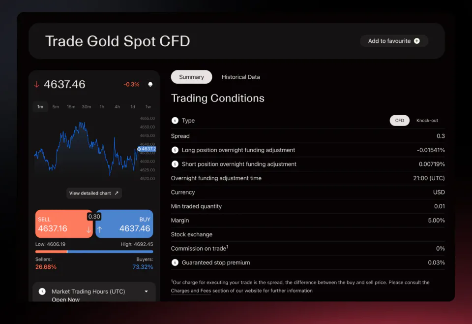
Theirs
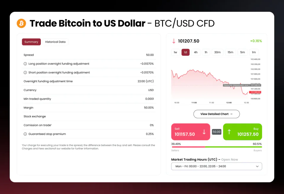
Ours
The whole site on one sheet
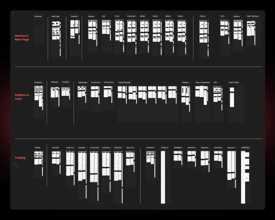
Most of the broker’s pages at once, in three groups: markets and the home page, the platform and its tools, trading.
Every instrument gets its own page. Forex, CFD, metals, stocks, indices, crypto, commodities, futures, ETFs, and that’s before the account types and everything around trading conditions.
Which is why I designed templates rather than pages. Draw that many one at a time and they’ll drift apart from each other long before the month is up.
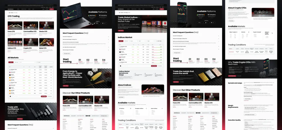
One template, six directions
CFD Trading is the hub. Six directions hang off it, forex, commodities, stocks, indices, crypto and metals, plus a single table covering every market.
They all share one template. The screens come in the same order every time: what the direction is, which platforms it runs on, common questions, four steps to a first trade, the markets available, trading conditions, spreads and swaps, margin requirements, execution quality.
Only the contents change. Its own photography, its own typical pairs, its own numbers, its own calls to action. Six pages built as one, and each still looks like itself.
Cross links at the foot. Every direction shows three neighbours, so someone who lands on metals from a search finds out five more markets exist.
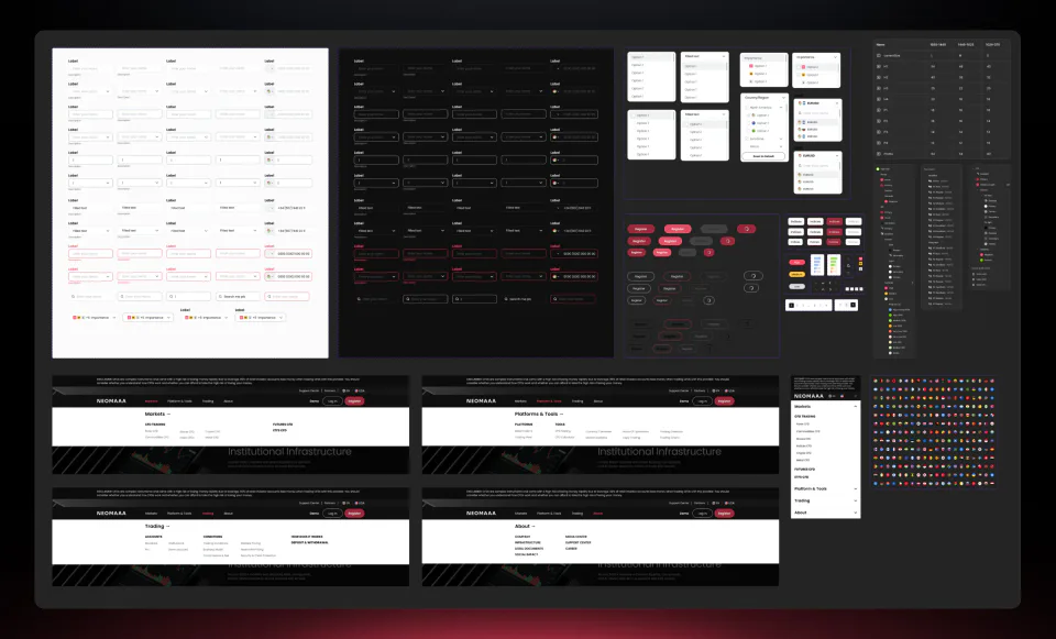
The design system
Same thinking, carried further. The library lives away from the pages, and every element is drawn in all its states at once: default, filled, error, disabled, for light blocks and for dark ones.
Forms. Fields, selects, checkboxes, toggles, search, phone entry with a flag. A broker site runs on far more of these than you’d think from outside: sign-up, filters, calculators, applications.
The menu is a component. Drawn out for every section, Markets, Platforms & Tools, Trading, About, plus the mobile accordion. An open menu is its own element with its own states, kept away from the home page mockup.
Icons and flags on their own grid. The site carries hundreds of instruments, and without a mark next to each one the lists turn into a wall of text.
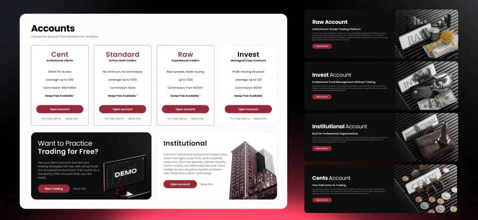
Six account types
Cent, Standard, Raw, Invest, Institutional and a demo. The comparison page is on the left, and each type gets a page of its own on the right.
Every type has its own artwork. A frame with the name spelled out in banknotes, coins or tape. You know which account you’re looking at before you read the heading.
Why bother. Accounts differ by numbers, and numbers all look alike. A picture does what a table can’t: people remember which one they picked.
Not every page made it into the frame, the row wouldn’t fit.
Platforms and tools
Platform & Tools is the shop window: two platforms and nine tools on one page, each a card with a photograph, a name and one line saying what it’s for.
Every card has a page behind it. MetaTrader 5, TradingView, VPS hosting, the CFD calculator, the currency converter, market analytics, trading hours, copy trading, the calendar, charts, trading signals.
The cards cover very different things. A platform, a working tool and a service aren’t the same kind of object, but in the grid they have to read just as evenly or the window falls apart into a list. So they all get one card shape.
Same skeleton inside, different filling. One page explains the tool and walks through four steps to connect it, another runs a live calculator on real rates, another just makes the case for it. Same order of screens, different contents.
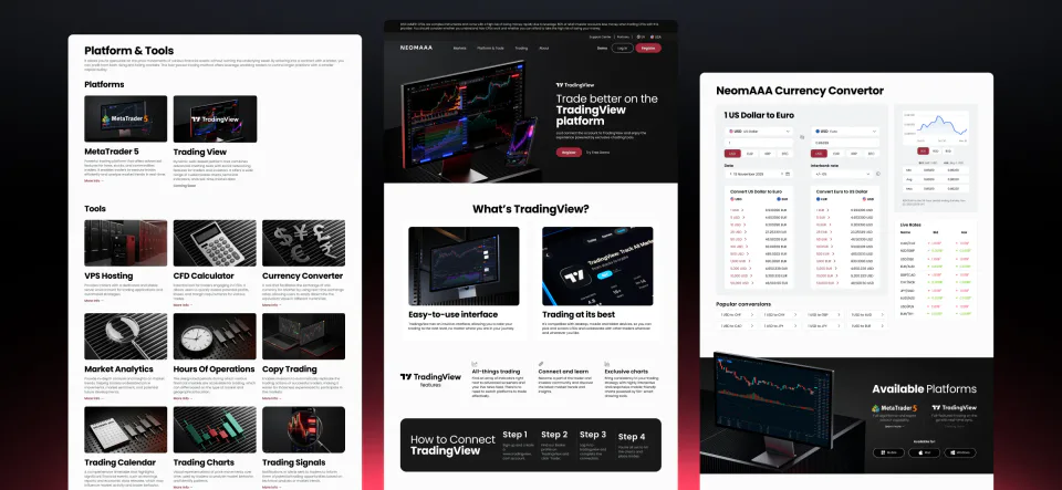
The hub page
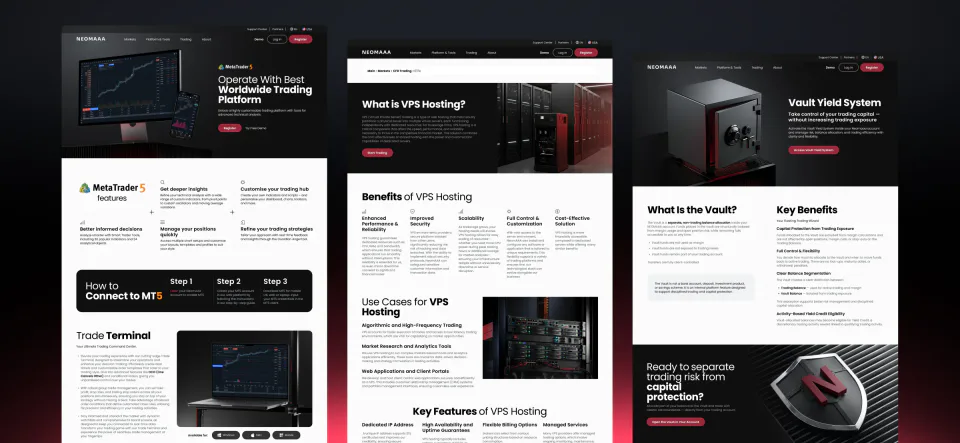
The inner pages
Conditions and the company
The sections that usually get whatever attention is left over. For a broker they’re where the trust lives, so they sit on the same grid as the markets and the accounts.
Eight cards in conditions, seven in the company section, plus a long read on technology and security where text and frames alternate.
Objects instead of icons. Every card carries a rendered object of its own, the same move as on the accounts and for the same reason: items that mean roughly the same thing blur into a list otherwise.
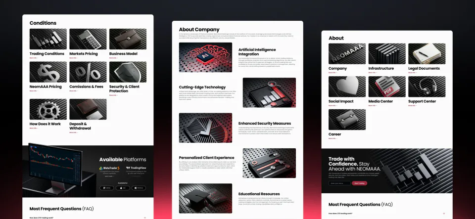
A banner library on variables
The broker’s ad banners were built as one system, never one at a time. The whole set exists at once, in every size, for every placement, in three languages.
A new banner takes three edits. Swap the image in one place, pick a colour, swap the translations in one place. Everything else recalculates itself.
In the recording, one change redraws everything. The colour switches, then the object shot, then the colour again over the new artwork. The whole sheet rebuilds each time.
Then the batch goes out to export. That was the entire point: nobody sits there drawing every size for every placement in every language by hand.
The events calendar
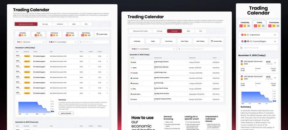
This is the calendar the fix card above is about. I kept the mechanics from the competitors and rebuilt the readability.
The expanded row. An event opens into a summary with a chart without taking you off the page.
One tab per kind of event. Macroeconomics, earnings and dividends need different columns, and no single table holds all three.
A separate page on how to use it, built around the three reasons people open a calendar in the first place. The mobile version is on the right of the frame.
Where the numbers come from. A job in its own right: quotes, spreads, the calendar, price history. I worked out what was reachable technically and handed the requirements to development. On a broker site that’s half the difficulty, because a handsome instrument page with no answer to where its data comes from is just a picture.
Copy trading, two versions in a row
For the MVP we took copy trading off the shelf, an MT5 block in an iframe. Fast, ugly, on time. We designed both versions from the start, though, because the second one was always coming.
Our own version, inside the dashboard. A few months later we rebuilt the same thing with our own means. It looks much the same; the difference is that the data and the scenarios are ours now, instead of running into someone else’s block.
Two directions, not one. You can copy other people’s trades, and you can open yourself up and let people copy you. A toggle on a single page doesn’t cover that: there are two scenarios and each needs its own screens.
Inside a strategy. The strategy card, the author with a rating and a subscriber count, the return over a period, which instruments it came from, and the full order history. The things people actually decide by when they pick someone to follow.
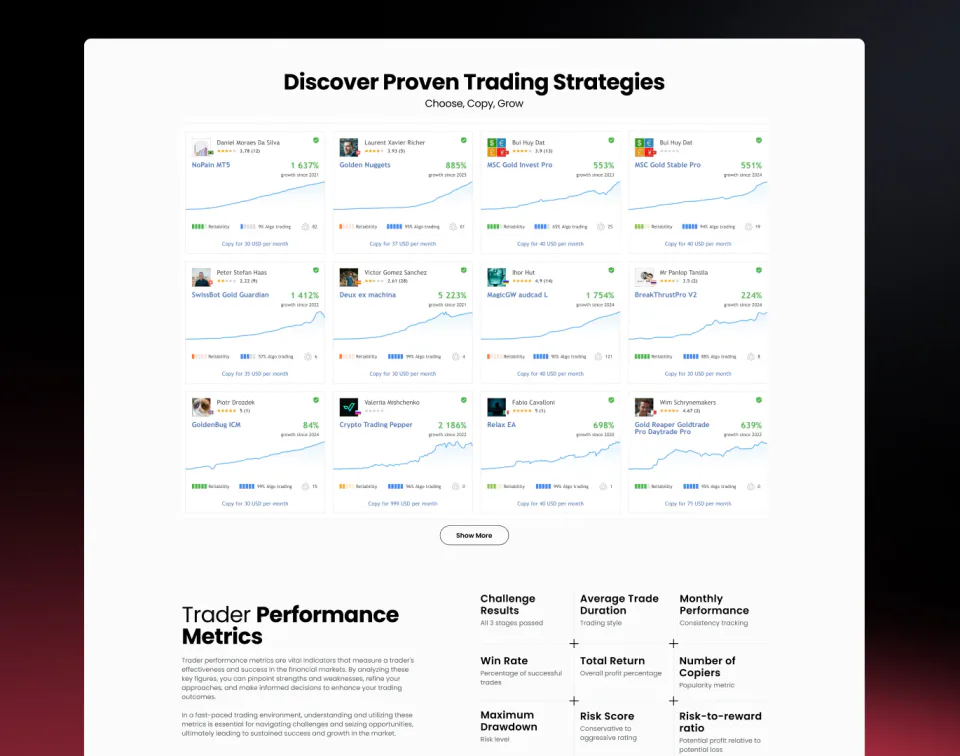
MVP, an MT5 iframe
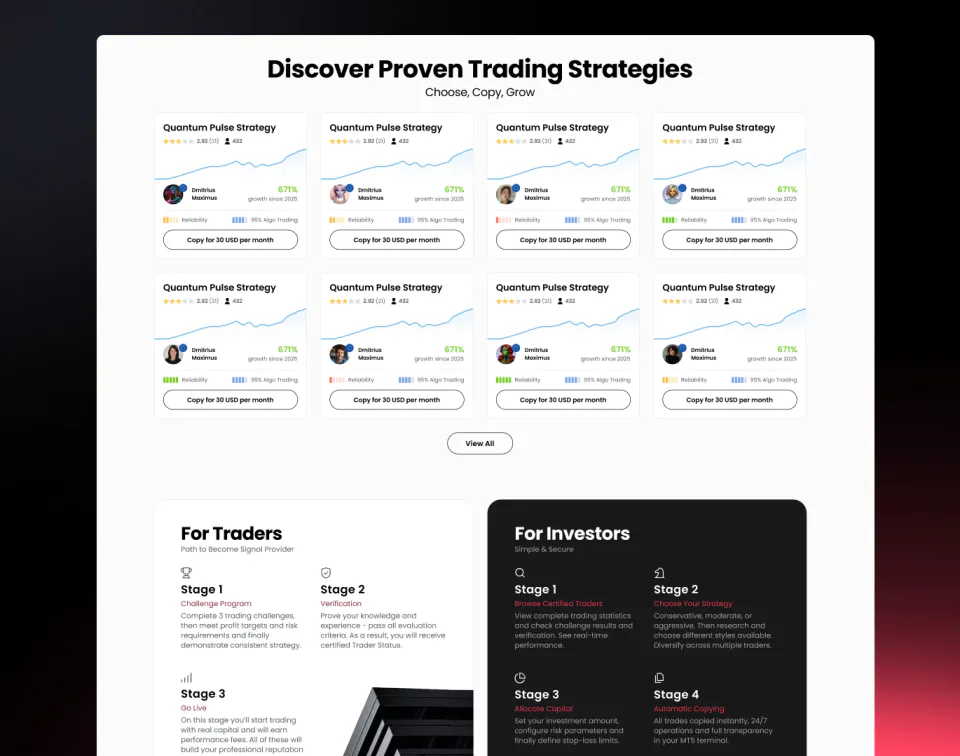
Our version
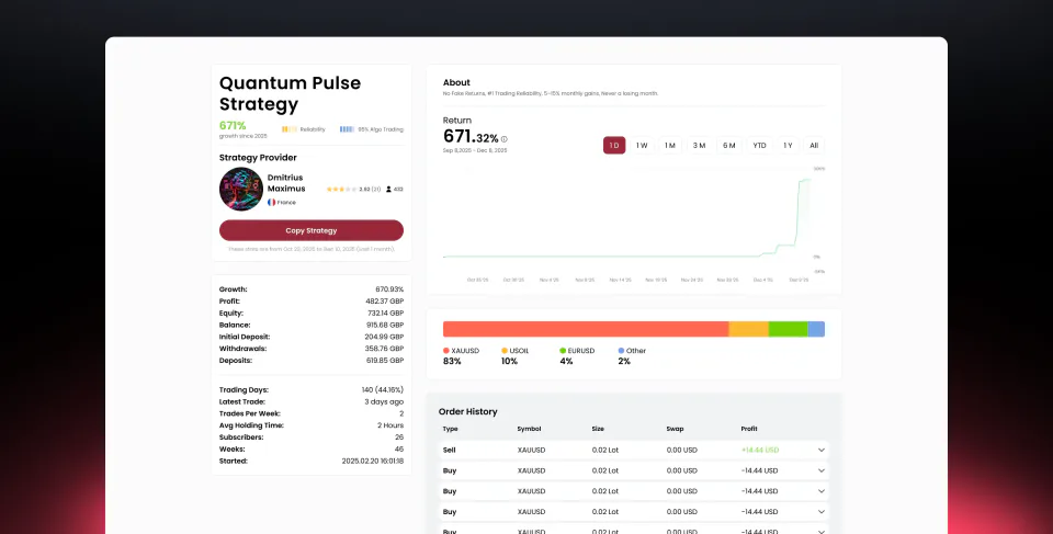
Inside a strategy