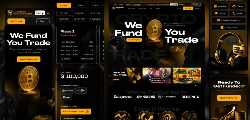
The crypto strand
NEOMAAA Crypto
The second strand, with a site of its own. Same challenge mechanic, different audience, and a different way of talking to it, right down to the colour.
- Web design
- UX/UI
What it was
The second branch, put together the same way as the futures one and set apart by colour: gold instead of purple. Challenge phases, plans and balances, market data providers, press mentions, FAQ.
One mechanic, two different languages. The rules and the arithmetic come straight from the main product; the way it’s dressed is built for its own crowd, because the crypto audience isn’t the futures one, and the creatives follow.
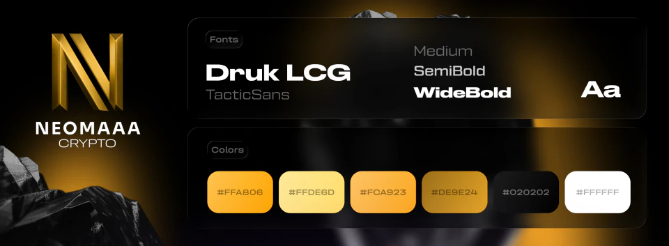
Type and logo
A type pairing of its own: Druk LCG for the big headlines, TacticSans for everything else. Plus a gold palette and its own cut of the logo.
Futures shares the display face and nothing else. Druk keeps the two branches related, the second typeface gives each of them a voice. The logo works the same way: same mark, its own wordmark, its own colour.
It’s one product, but people come at it from different directions. Crypto ads live in their own channels and talk their own way, futures ads live in others. Send both crowds to the same page and they lose the thread. Colour holds it from the first ad to the payment, and it costs exactly one repaint, because the arithmetic and the rules underneath are shared anyway.
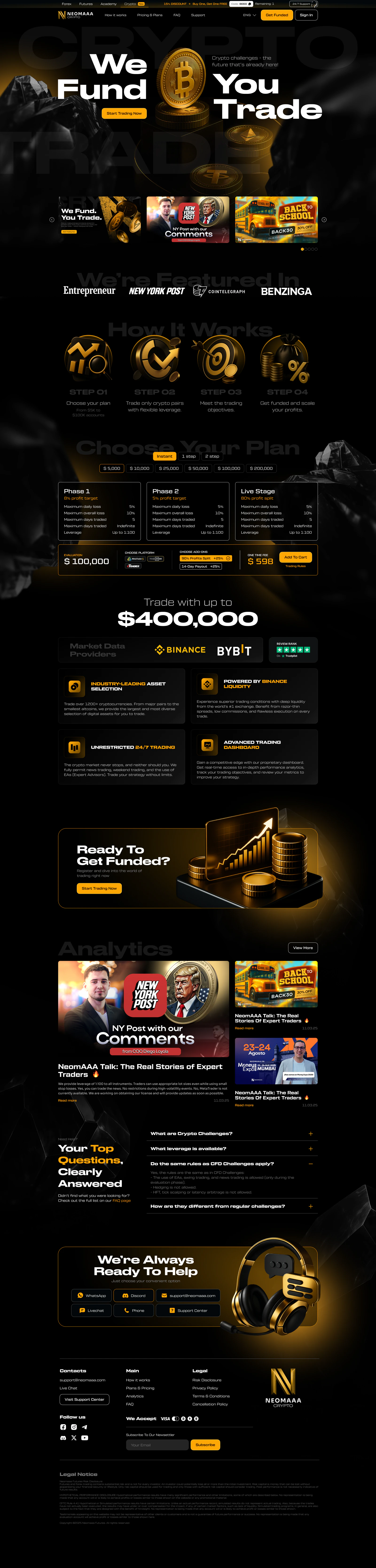
The page in full
The landing page as one sheet, so you can see its shape and how long it runs. You’re not meant to read it here, that’s what the screens below are for.
The hero
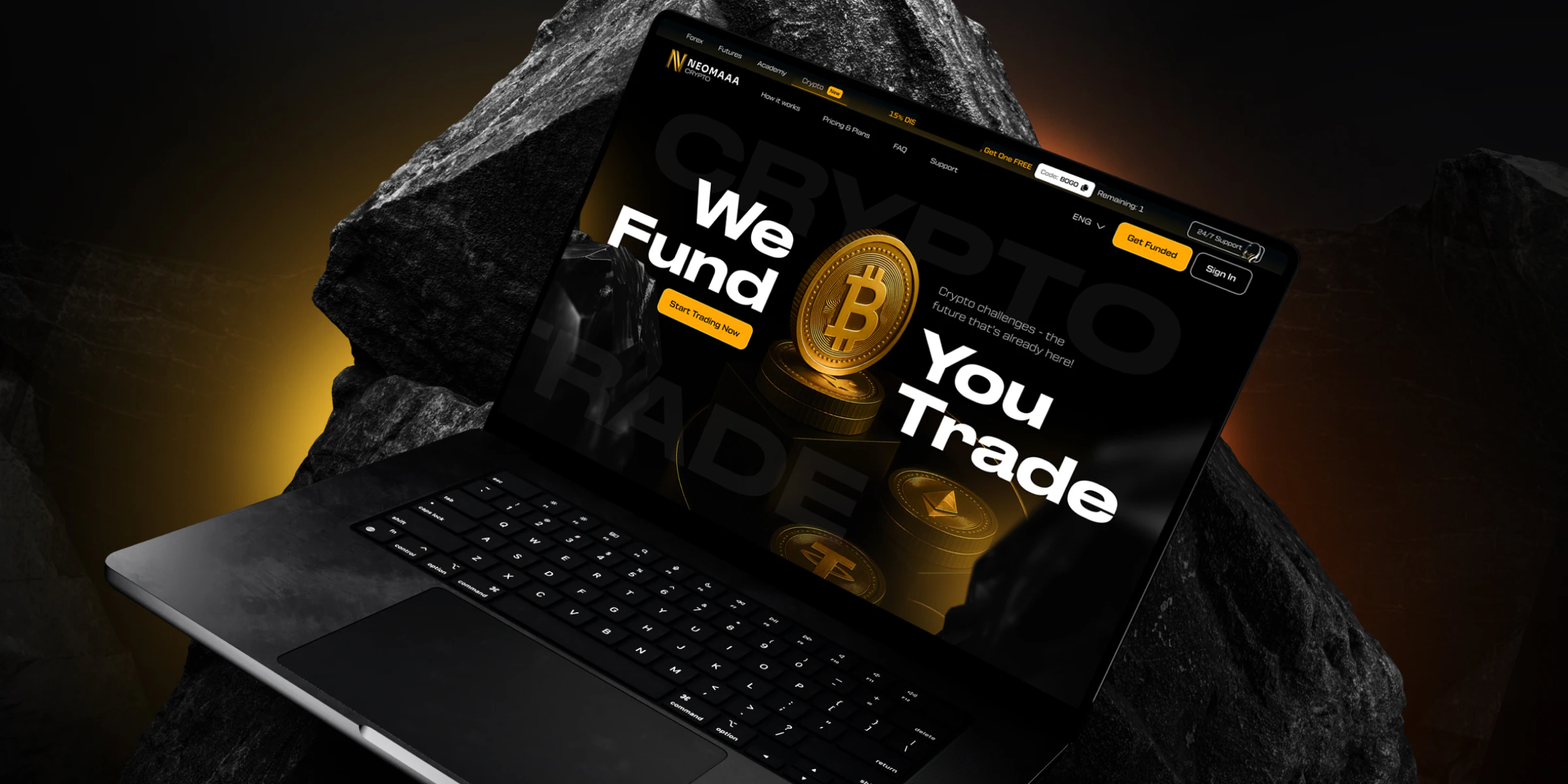
The promise up front: we fund, you trade. Bitcoin in the middle so the market is clear at a glance.
Creative carousel
Promotions and news right on the first screen. The crypto audience lives on news, and a moving strip works better here than a static banner.
Press mentions
On a market full of dubious platforms this is the first argument that the company is real.
How it works
Four steps from picking a plan to being funded. The same device as on futures: a challenge looks long until it is laid out.
Plans
Challenge type and account size on toggles, three phases with their rules below, and an add-on calculator. Everything adds up on the spot.
Volume and data
The largest account as a headline number, next to the market data providers and the Trustpilot score. Three different arguments in one screen.
Advantages
A tile of four: asset choice, Binance liquidity, round-the-clock trading, an in-house dashboard. Each with an explanation under the headline.
The call
The button repeated before the analytics section, because anyone who has already decided won’t scroll further.
Analytics
Own material and press mentions. The same thing as in the header, but at length: the company lives in the news, it doesn’t only sell challenges.
Questions
Common questions right on the page, answering the rules, the leverage and how this differs from an ordinary challenge.
Support
Six channels in one screen: WhatsApp, Discord, email, live chat, phone, support centre. In crypto the requests arrive around the clock and from everywhere.
The footer
Navigation, legal links and the disclaimer. A financial product must carry one, and it takes up half the footer.
Mobile and tablet
And plenty of people arrive on a phone. Every screen is worked out separately for mobile and tablet: the news carousel narrows to one card, the three challenge phases stack up, and the six support channels fold into two rows.