The prop firm’s main storefront
The NEOMAAA Funded website
The prop firm’s main site. It’s where a trader first hears about the company, and the way in to a challenge, the dashboard and the payout terms.
- Web design
- UX/UI
- Design system
What it is
The prop firm itself, and the base of the whole ecosystem. Everything else grew up around it: the brokerage, the education arm, media, events.
The site is where a trader first hears about the company at all. From here they go to a challenge, to the dashboard, to the payout terms, and here they work out whether it’s worth putting money in.
The whole site on one sheet
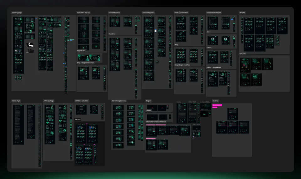
The site in full: the home page, the challenges, the terms, everything around trading and all the utility pages.
Several dozen pages, and almost all of them are custom. No shared page template holds them together, the component library does that, and it’s on the next frame.
The components it is built from
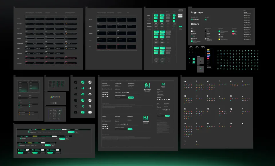
And here’s the set the whole site rests on: buttons and their states, fields, tables, cards, tabs, modals, icons.
One source of truth. Change a component and the change reaches every screen at once, instead of being carried by hand from page to page.
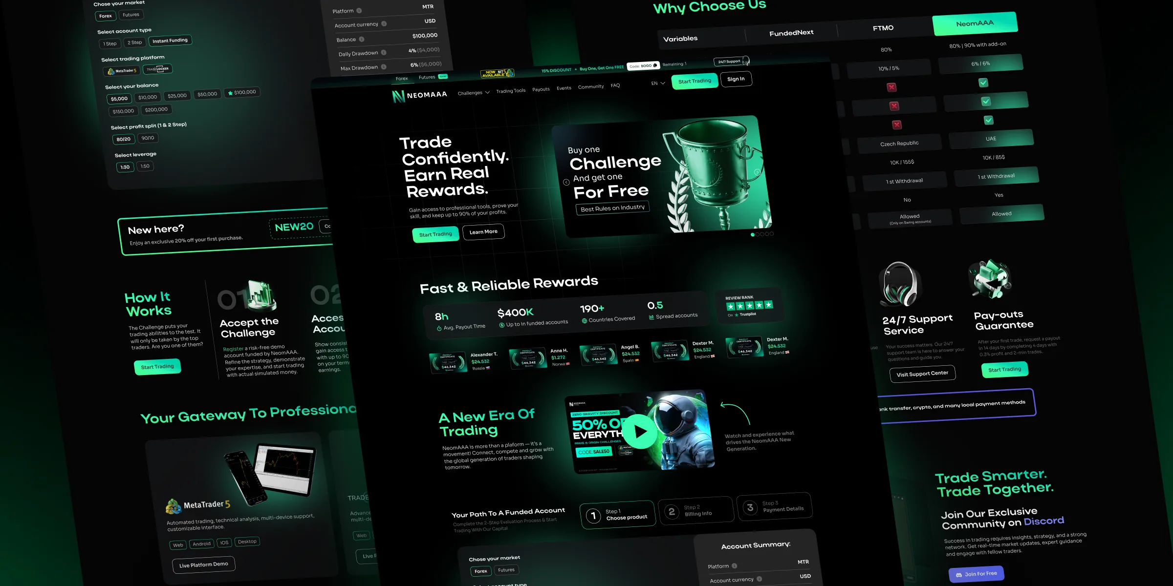
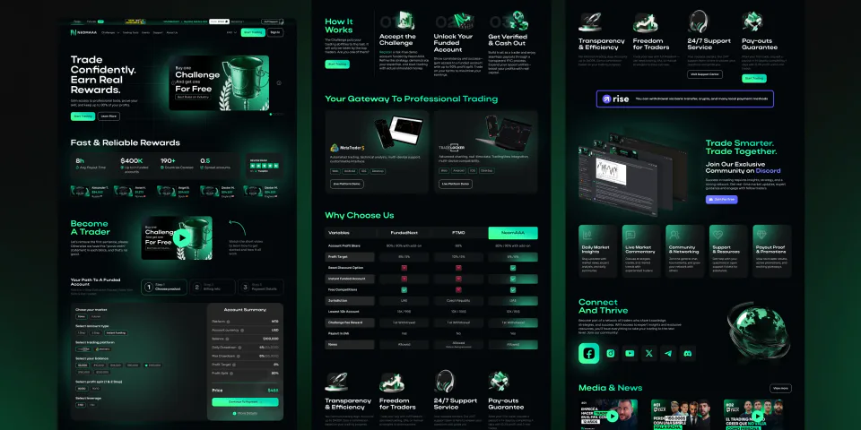
The home page
One page carries the lot: the products, the calculator, the comparison against competitors, the news, the social links.
A long page that has to work in a single pass. The blocks follow the order a trader asks things in: what is this, what does it cost me, why are you better than the rest.
The affiliate programme
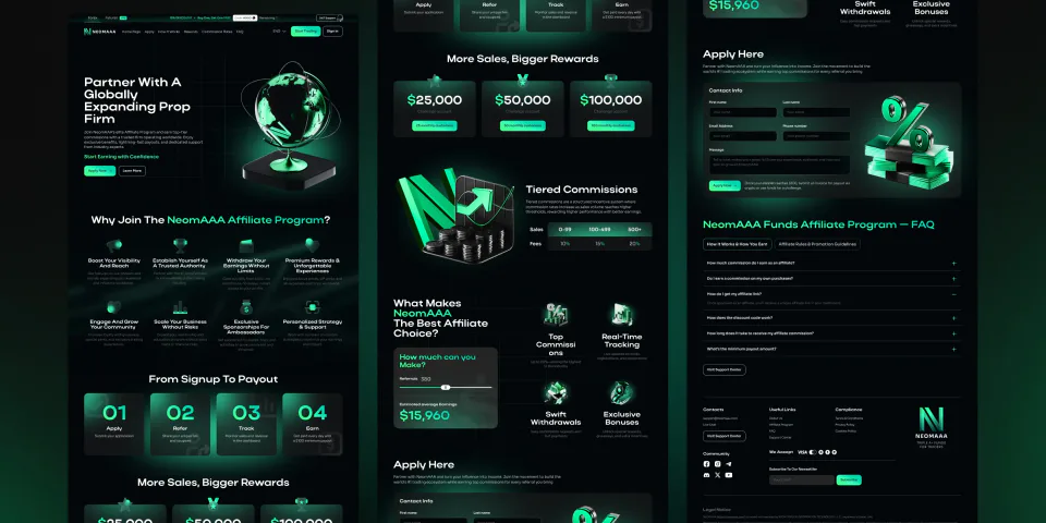
The affiliate programme gets a page of its own: how the reward works, what each tier pays, and how many people you have to bring in to reach it. There’s a contact form at the bottom.
One of the earliest versions of the site. The visual language moved on afterwards, and this page shows where it started.
Events and webinars
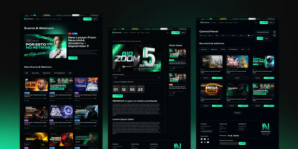
A list of events, online and offline, filtered by state: upcoming, registered, attended, past. The webinar itself gets its own page with a countdown and sign-up.
The same webinar often ran twice, in Spanish and in English. Everyone got their own link, and the decks were made per language too. That’s why the event page asks you to pick a language, one sign-up button doesn’t cover it.
The calculator
Nobody wrote a brief for the calculator. Same as on the brokerage, I pulled other people’s apart: which ones are laid out well, what gets calculated and in what order, which fields anyone actually fills in. The version running on the site today came out of that.
The site is being redesigned right now. It’s being rebuilt for current trends and tuned for language models, which are also putting it together. The calculator from that work is on the right, and it’s the only screen from the new design here.
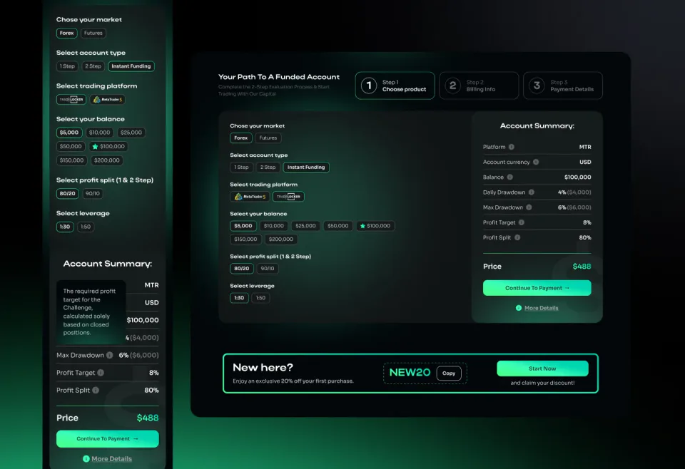
The version live on the site
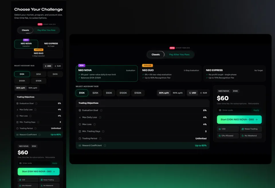
The version from the redesign
Buying a challenge
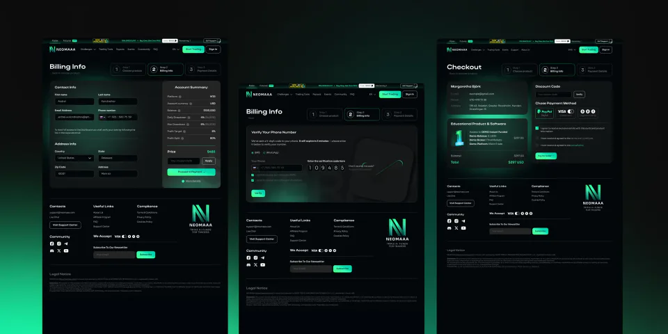
What happens once the calculator has settled the product: contact details, phone verification by code, then a final checkout with a promo code, the order contents and the total.
Three steps, and the counter stays visible on every screen. The order sits alongside the whole way: platform, balance, drawdowns, target, split. You can see what you’re paying for at any point.