The futures strand
NEOMAAA Futures
A site of its own for the futures strand. Same challenge mechanic as the main product, an entirely different visual language.
- Web design
- UX/UI
What it was
Futures is a branch of the funnel of its own. Its own page, put together its own way: how the challenge runs, plans and balances, platforms, a comparison against competitors, FAQ. It leads to the same place, buying a challenge.
The calculator barely moved, the visual language moved entirely. The rules and the arithmetic are shared with the main product; everything you can actually see was built again.
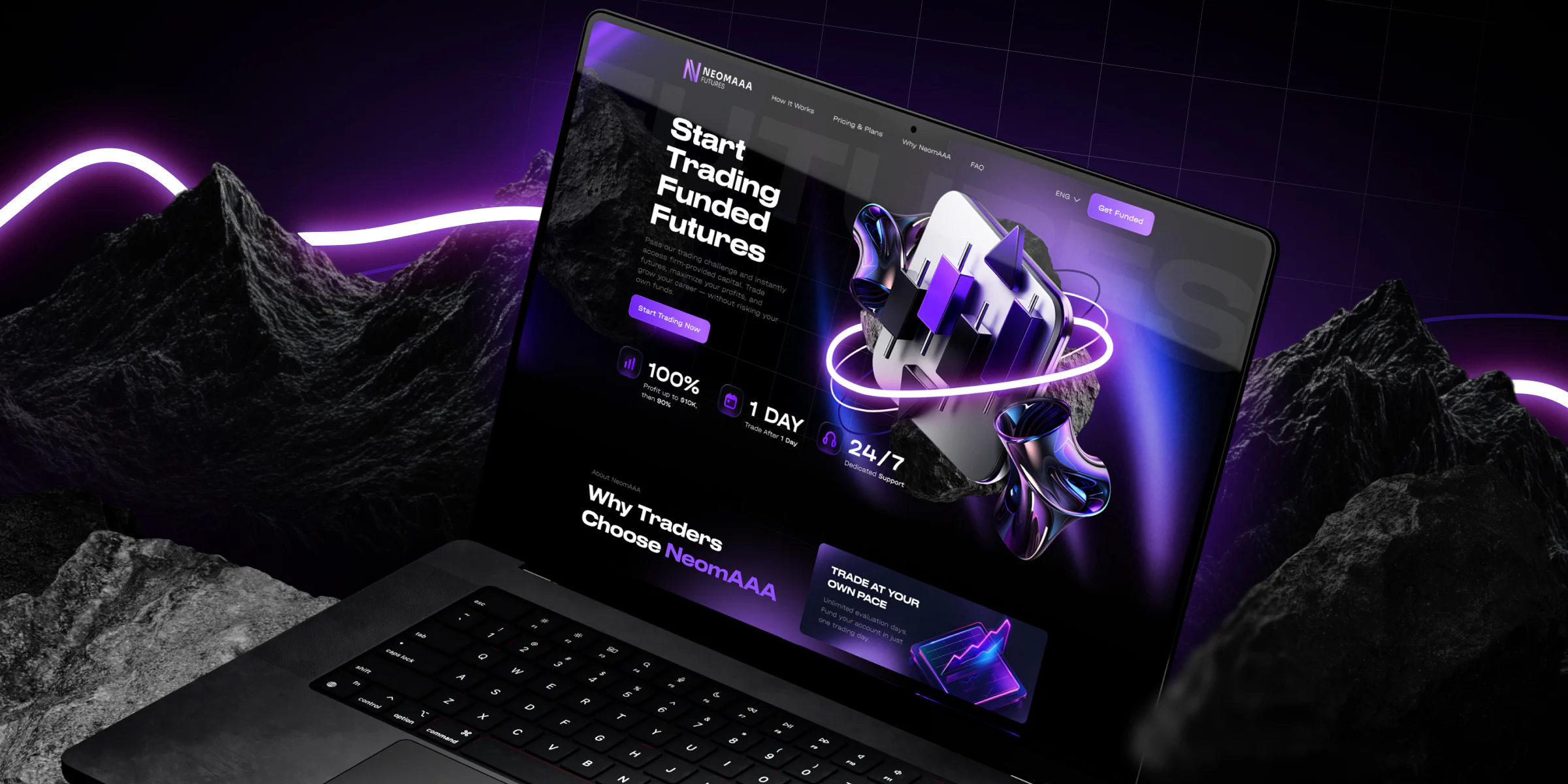
Type and logo
A type pairing of its own: Druk LCG for the big headlines, Halvar Breitschrift for everything else. Plus a palette and a cut of the logo made for the strand.
The logo is what tells the two branches apart. Same mark, but its own version and its own wordmark, because futures shouldn’t get mistaken for the ordinary prop product in a feed or in a site header.
Purple works as the mark of the branch. You see a creative in that colour, land on a page in the same colour and buy. Continuity from the ad to the payment: at every step you can see you got where you were going, and you never stop to check whether this is still the right site.
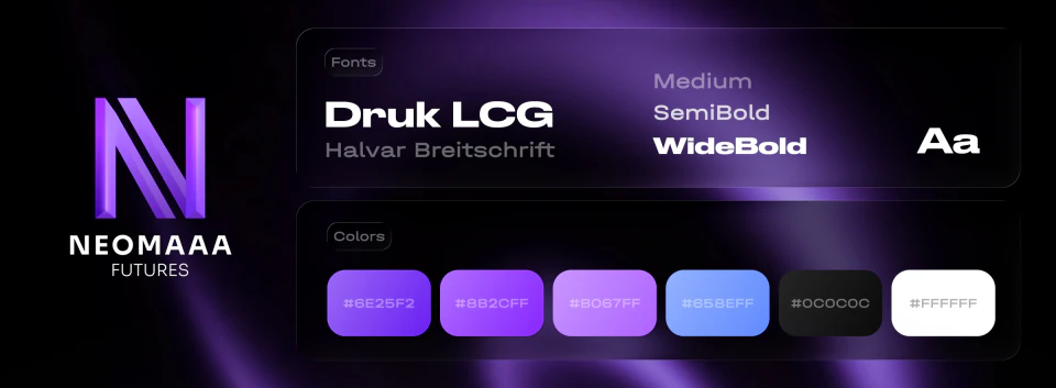
The page in full
The landing page as one sheet, so you can see its shape and how long it runs. You’re not meant to read it here, that’s what the screens below are for.
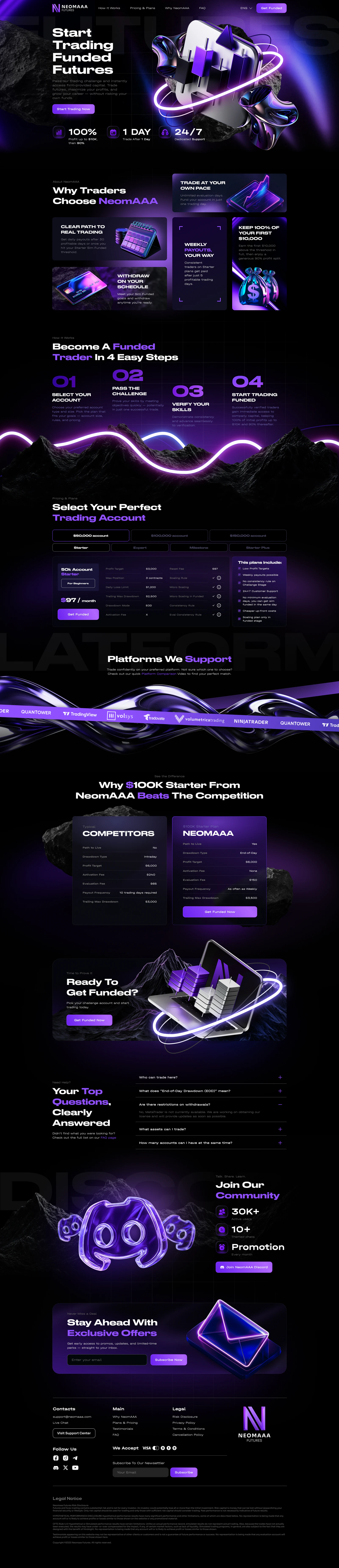
The hero
The promise and the three numbers a trader decides on: profit split, time to trading, support.
Why us
Advantages as tiles of different sizes. The large ones carry what decides, the small ones finish the case.
Four steps
The path from choosing an account to being funded. A challenge looks long until it is laid out in steps.
Plans
Account and plan on toggles, the terms table beside them. All in one screen, with no trip to a separate page.
Platforms
Logos on a strip: there are many platforms, and the length of the list matters more than any single name.
Against the competition
Two columns side by side. The same device as on the main site, and it works the same way here.
The call
The button repeated before the FAQ, because anyone who has already decided won’t scroll further.
Questions
The five most common right on the page, the rest on their own.
Community
Discord with member counts. In prop trading a living community is an argument in the decision.
The newsletter
For the ones who didn’t buy today: an email address in exchange for early access to promotions.
The footer
Navigation, legal links and the disclaimer. A financial product must carry one, and it takes up half the footer.
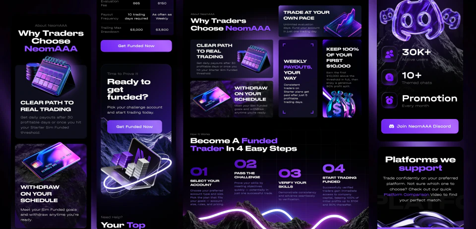
Mobile and tablet
And plenty of people arrive on a phone. Every screen is worked out separately for mobile and tablet: long rows stack up, the terms table unfolds into cards, and the competitor comparison stops being two columns.