
Two users in one product
Client dashboards
One dashboard was serving a trader and an affiliate at the same time. People kept getting lost, and behind the confusion sat a hole in the funnel.
- Product design
- UX/UI
 Part of the NEOMAAA ecosystem
What it is
NEOMAAA is an international prop firm: pass its challenge and it puts money under your management. A brokerage, an education arm, media and events grew up around it. This is that company’s client dashboard.
There was never just one dashboard. A client one, an affiliate one, and a version that tried to be both, with the line between them drawn and rubbed out again and again.
Two different people live in there, and they want opposite things. Everything that follows is the story of pulling them apart.
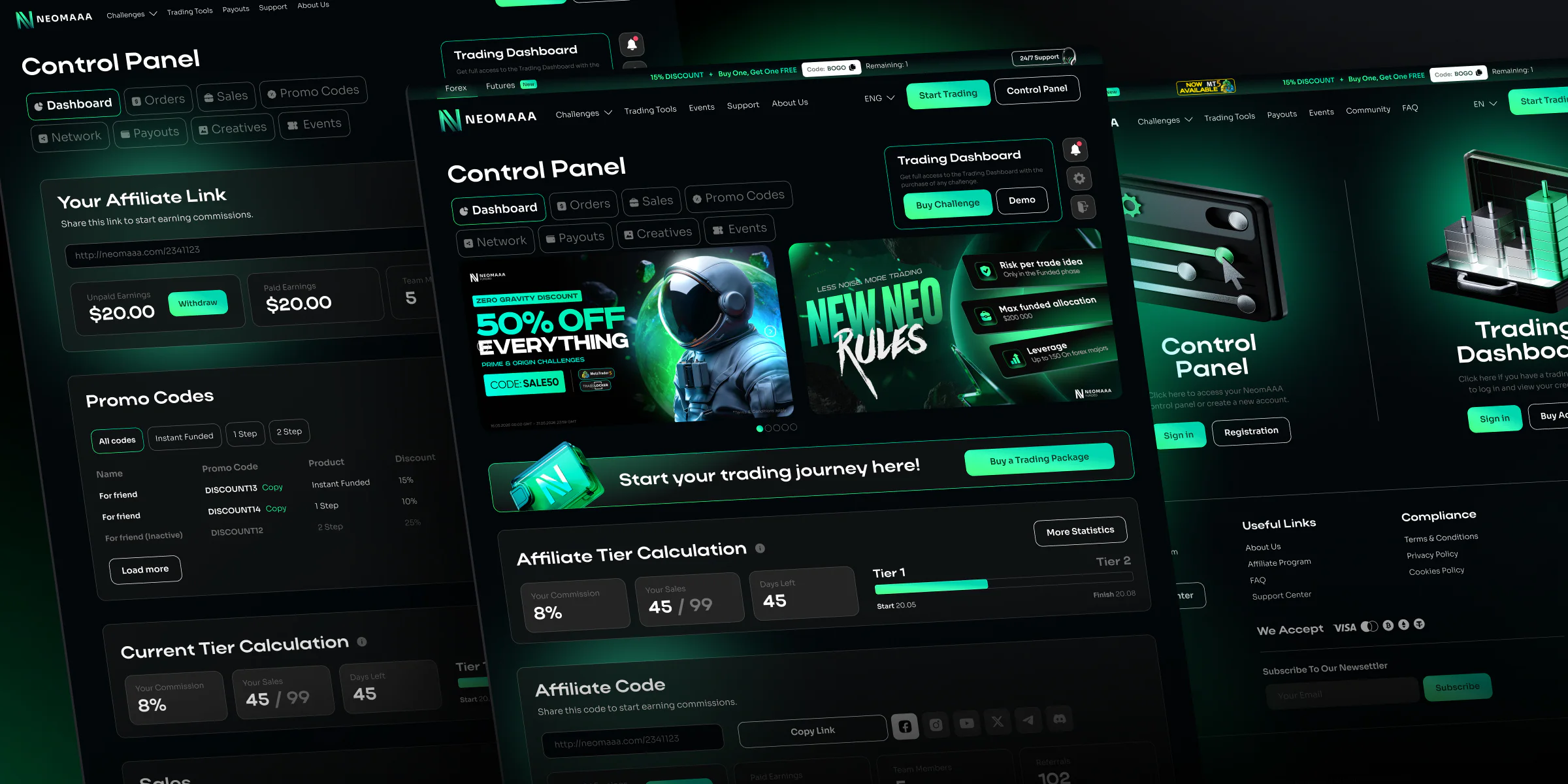
Who lives here
One product, and people turn up for different reasons. The trader wants to trade. The affiliate has no intention of trading at all.
Came here to trade
Trader
- Buy a challenge
- Move to MT5 and trade
- Stay inside the rules
- Withdraw what they earned
Does not trade
Affiliate
- Bring people in through a link
- Hand out discounted promo codes
- Track sales and commission
- Collect referral rewards
The first version sat them both in one dashboard
That is where it started: half the screen was useless to each of them, and there was no way to take it away.
Everything in one place
The first version went like this: home page, sign in, and then one control panel for everybody. Statistics, referral links, promo codes, payouts, all on the same screen.
Two banners saying the same thing. "Trading Dashboard" and "Start your trading journey here" both went to the same place, buying a challenge, just in different words. That’s what serving two people with one screen looks like.
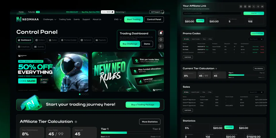
What was inside
A referral link, promo codes with discounts of their own, tier calculation, sales, team, payouts. The tier ran on volume: one per cent up to a hundred sales, a second rate after that, a third past two hundred.
An ordinary trader needs none of it. They came here to trade and they’re looking at a salesperson’s panel.
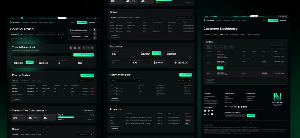
The inner pages
Promo codes and sales, network statistics, payouts. Payouts have a gate of their own: until you’ve made a first purchase and passed KYC, withdrawal stays shut.
This is where the real problem came out. You only get the trading dashboard when you buy a challenge, which means an affiliate could sit in that panel for years without ever becoming a customer. That’s not a navigation problem any more, that’s a hole in the funnel.
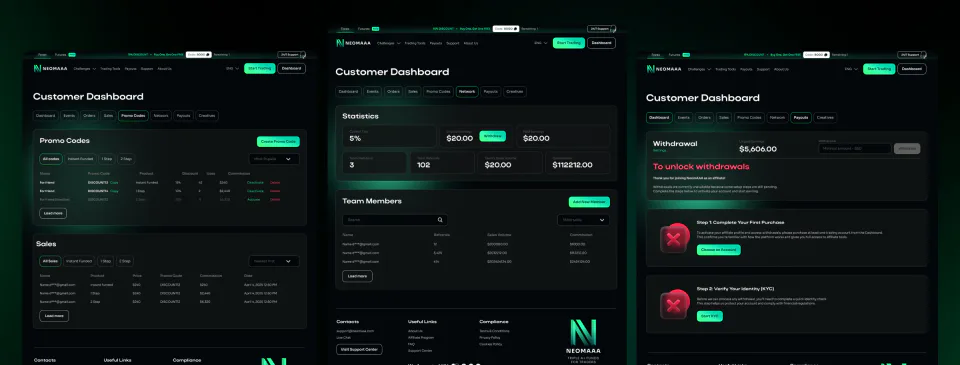
The utility steps
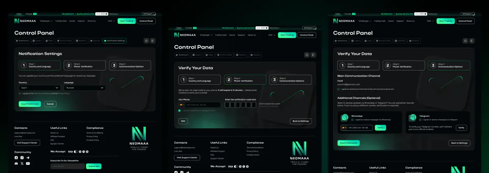
Three steps on the way in: country and language, phone verification by code, then which channels we can reach you on. Email, WhatsApp, Telegram.
A legal requirement that doubles as a database. Consent to be contacted had to be asked for outright, and the phone number came along with it, on top of the email.
A fork at the entrance
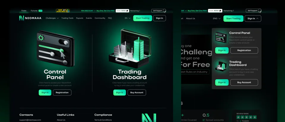
Shuffling the blocks around was never going to fix it. The answer turned up earlier in the path: you pick on the way in, control panel or trading dashboard.
Two doors instead of one panel for everybody. After that each of them lands somewhere that has everything they need and nothing they don’t.
How it was
Trader and affiliate together
- The site
- One shared dashboardReferrals, promo codes, tiers, challenge purchase
- Trading dashboard
One road for two people, with the way into trading at the very end of it. Half the dashboard was dead weight to each of them, and trading access only opened after a challenge was bought.
How it is now
Trader
- The siteThe fork sits on the home page
- Trader dashboardStripped back, challenge purchase only
- Trading terminal
Affiliate
- The siteThe fork sits on the home page
- Affiliate dashboardSeparate, access on request
The trader no longer hunts for the way in: it is on the home page. The affiliate has a dashboard of their own, and nobody lands in it by accident.
Sign-in states
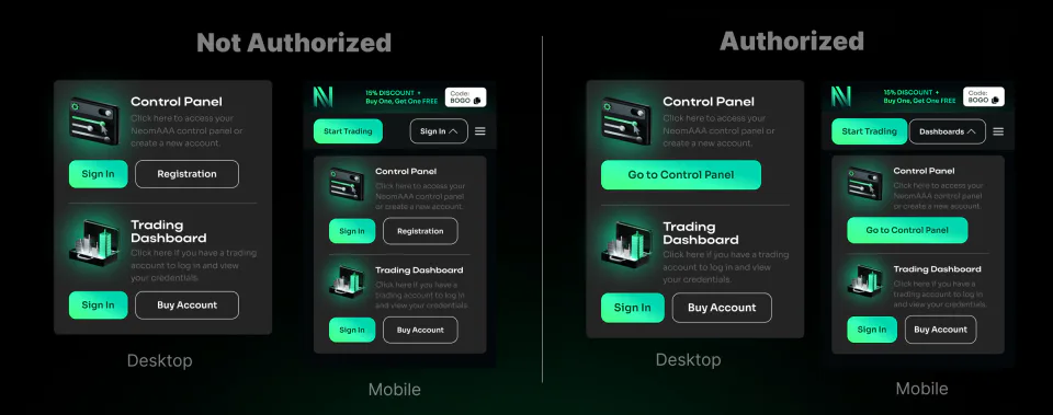
The fork lives in the header and changes with your status. Signed out, each half offers sign-in and registration. Signed in, it takes you straight through to your own panel.
Mobile is worked out separately. Two columns won’t fit in a phone header, so the choice turns into a dropdown, but it’s still the same choice.
The affiliate dashboard
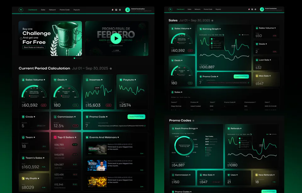
A product of its own for the people who bring others in. Sales volume, deals, income, payouts, circle and commission, the team and the top sellers, webinars coming up.
Broken down to the promo code. You can see what each code brought in, what discount it carries, what came through it and how much is ready to withdraw. Marketing material sits next to it, so there’s something to invite people with.
How it ended
First came a patch. A card linking to the trading dashboard placed inside the affiliate panel. It took the symptom away but left everything the person didn’t need on screen.
Then the fork. A choice at sign-in, before any hunt for the right section inside.
And the main one. For ordinary traders the affiliate side was removed entirely, and affiliates started getting access separately and on request. Not hidden behind a tab and not folded into an accordion. Removed. The problem disappeared because it stopped existing.
Cross-cutting things such as withdrawals stayed shared, because both sides use them.